
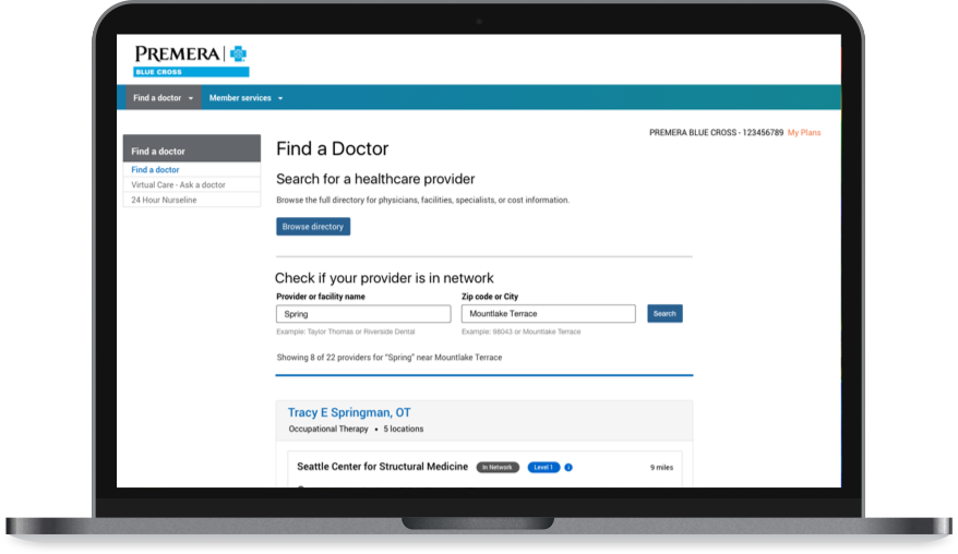
Helping Premera’s members (customers) easily get the care they’re looking for.
ROLE
UX Designer
Web app design | User Research | Interaction Design | Visual Design | Prototyping | Usability Testing | Content Design
Premera’s Customer Experience team wanted to create a better provider search experience for their members. Premera’s website did not have their own search experience and they were using an external vendor’s services to redirect users. As a result, members were dissatisfied about not being able to easily find what they were looking for and Premera’s customer service was receiving a high call volume. Our goal was to build a search experience and reduce the call volumes. As an MVP, we started by building an tool that helped users get the necessary information before visiting a provider or a facility & verify if they are covered by their health insurance.
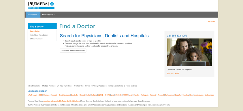
The old page did not offer any search functionality. The only interactive element was the button that would take users to a vendor’s search page.
This product was designed for people having Premera's insurance.
User Goal
1. Is my doctor/facility covered by the health insurance?
2. Which locations are they available in? What is the contact information?
Design Goal
Create a search experience that allows users to search for doctors and hospitals covered by their health insurance and provides all the necessary information needed to make a visit.
Business Goal
Provide a better web experince for members & reduce call volmes to customer service.

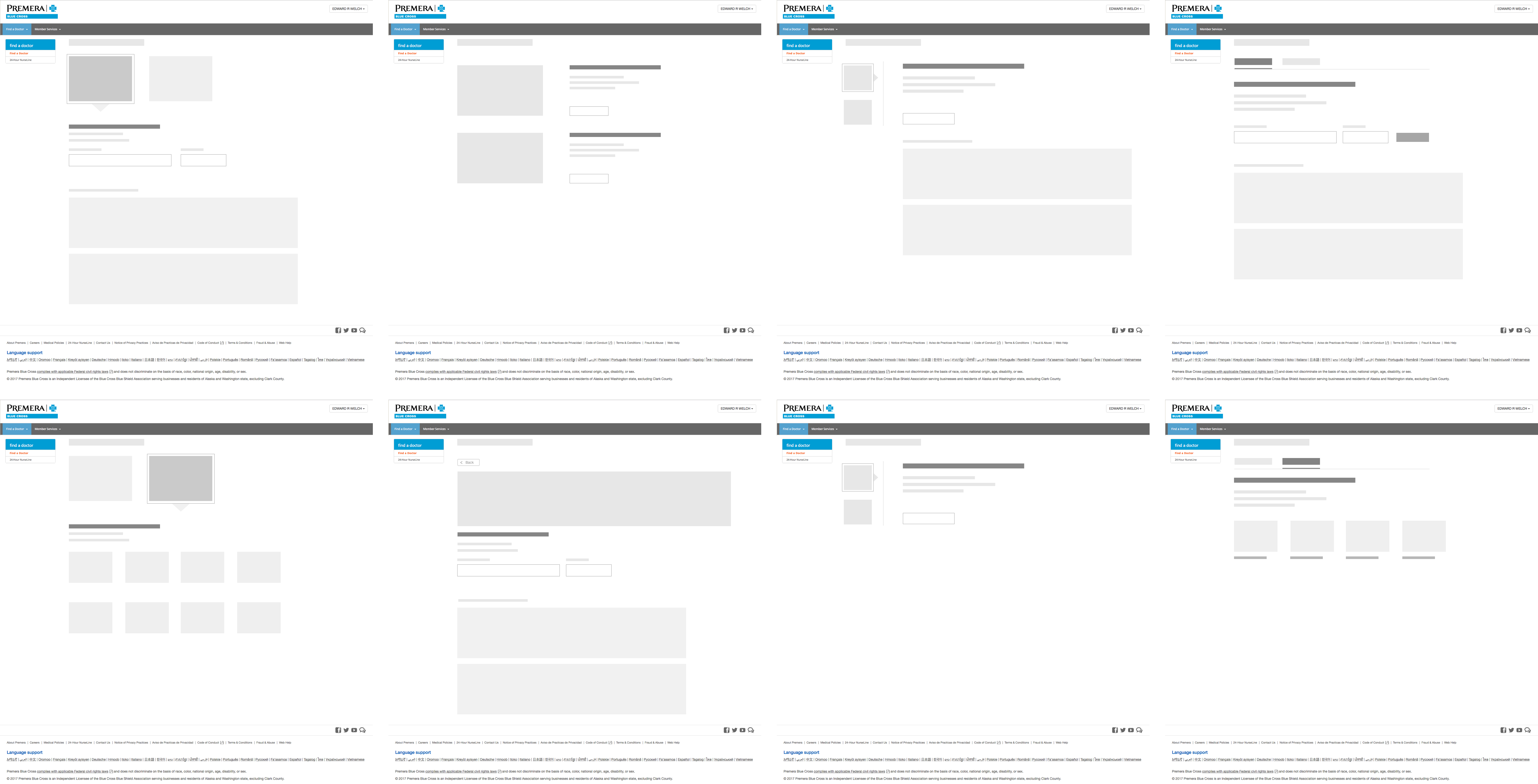
The design process began with some early explorations on layout and content design. I collaborated with design strategsists and other UX Designers to come with a broad set of possible layout ideas and created wireframes for the page as illustrated below.
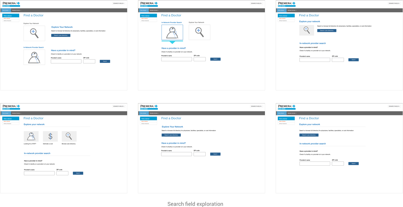
Throughout the design process, I came up with a broad set of design ideas, discussed them with the team before converging on a couple of strong versions that fit the user needs & development constraints.
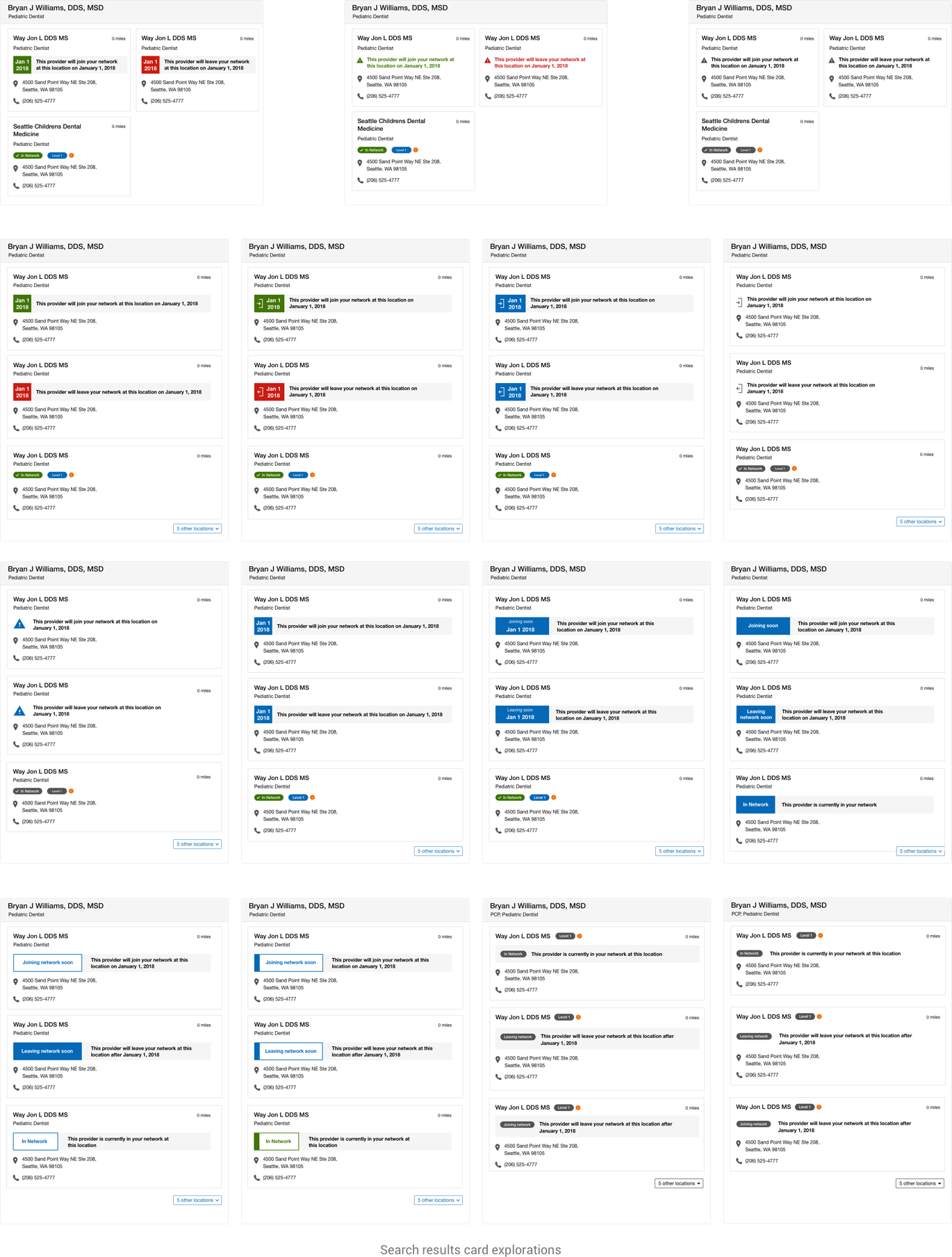
After discussing the design explorations and taking feedback from the stakeholders, the final concept was designed. The design had to comply with the patterns and brand guidelines approved by Premera's UI dev team. At the
time of designing this interface,
Premera used the Bootstrap front-end framework.
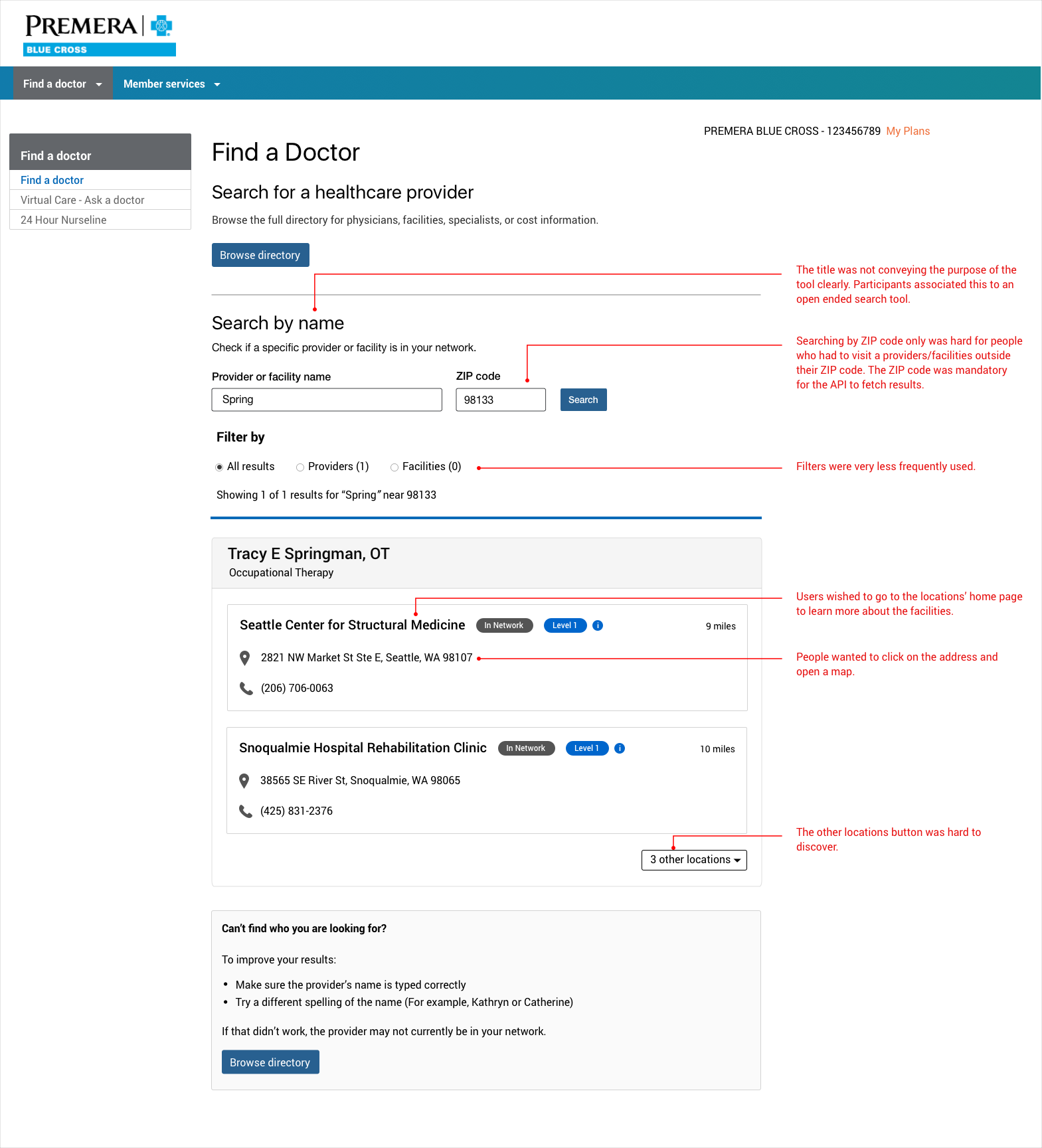
A prototype of the tool was created and tested with 8 participants using InVision. Some of the important findings from the study can be seen in the
image below.
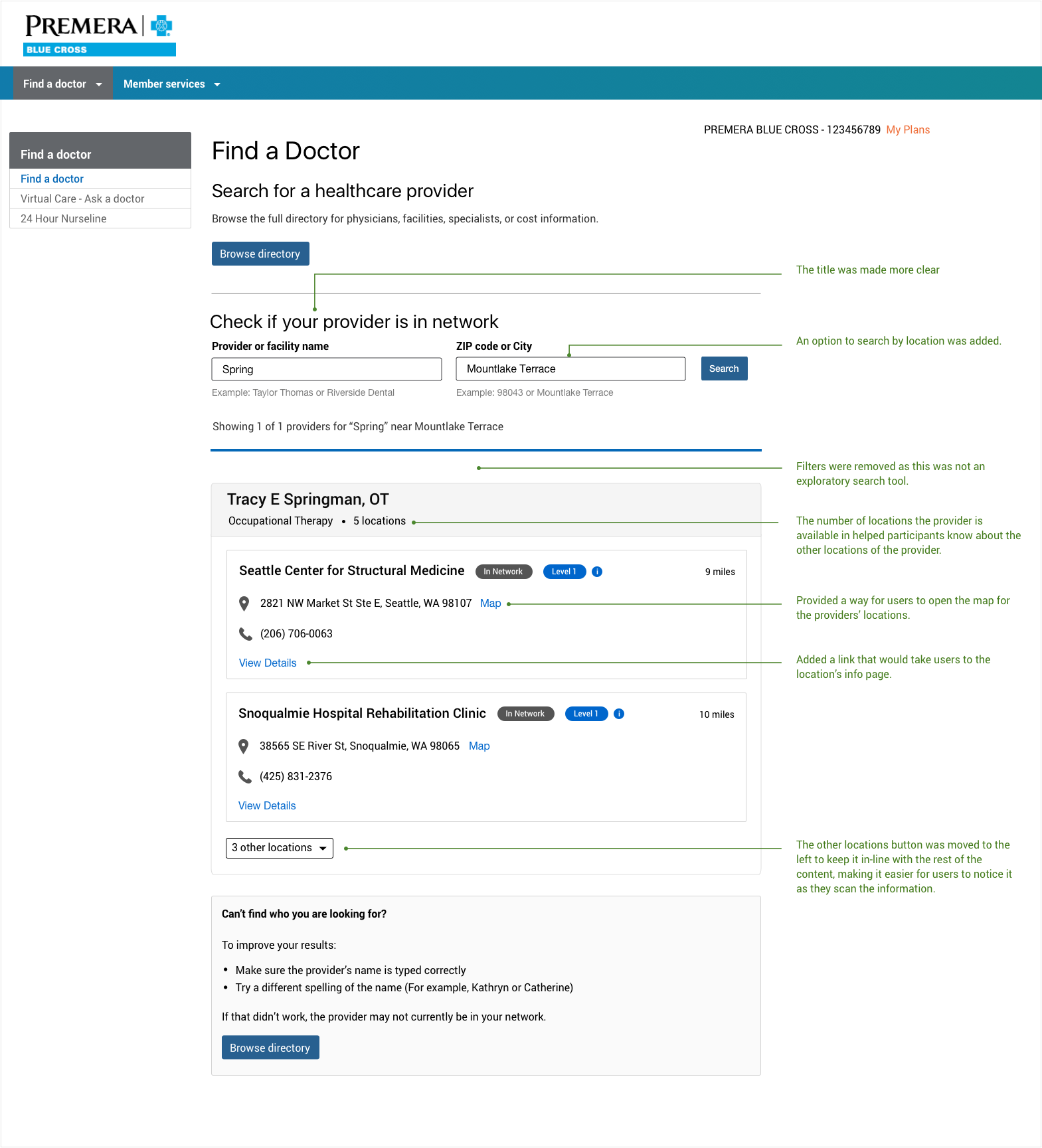
Based on the findings, suitable changes were made to the interface.
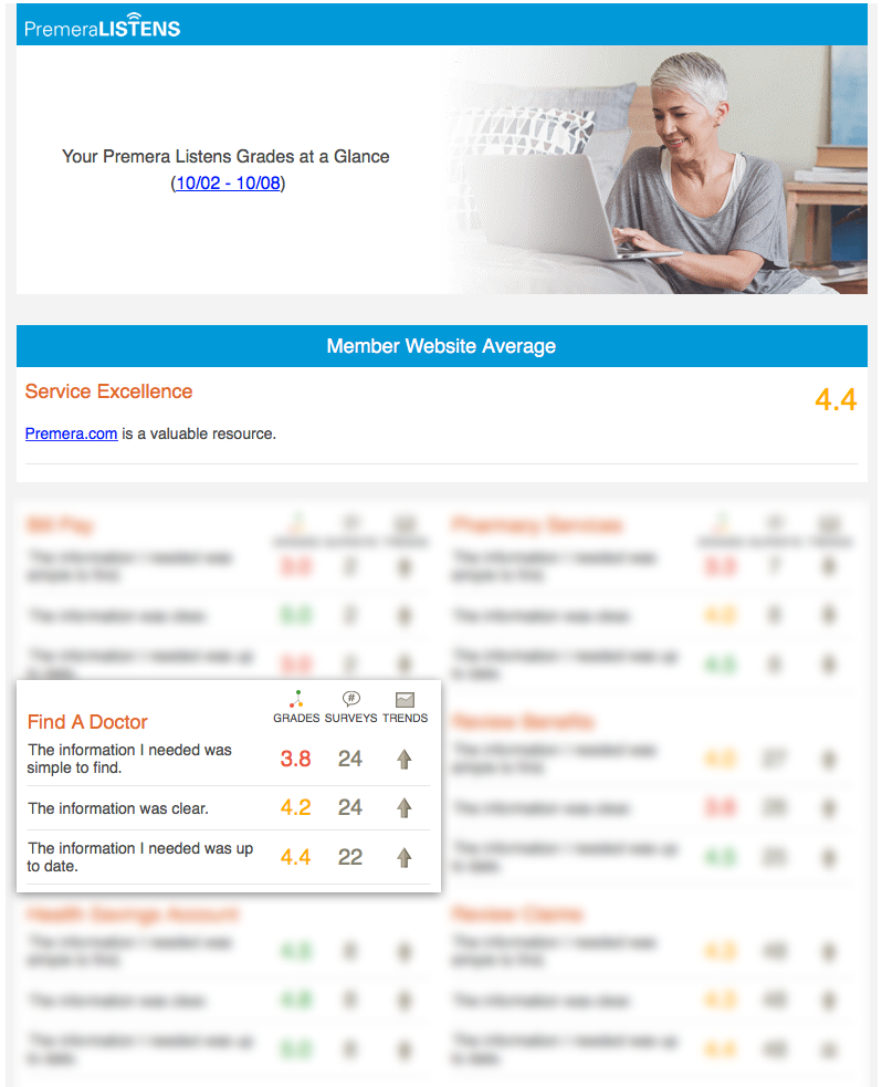
The tool had an overall positive reception from users. Premera runs a weekly survey called 'Premera Listens' where they collect feedback from the members on various touchpoints in the experience.
Before this tool was
launched,
the score for the 'Find a doctor' experience was ranging between high 1s to Low 2s (on a scale of 1 - 5). After the tool was released, the scored went up in the range of 3.8 - 4.4.
© 2018 Setumadhava Kathawate. All rights reserved.