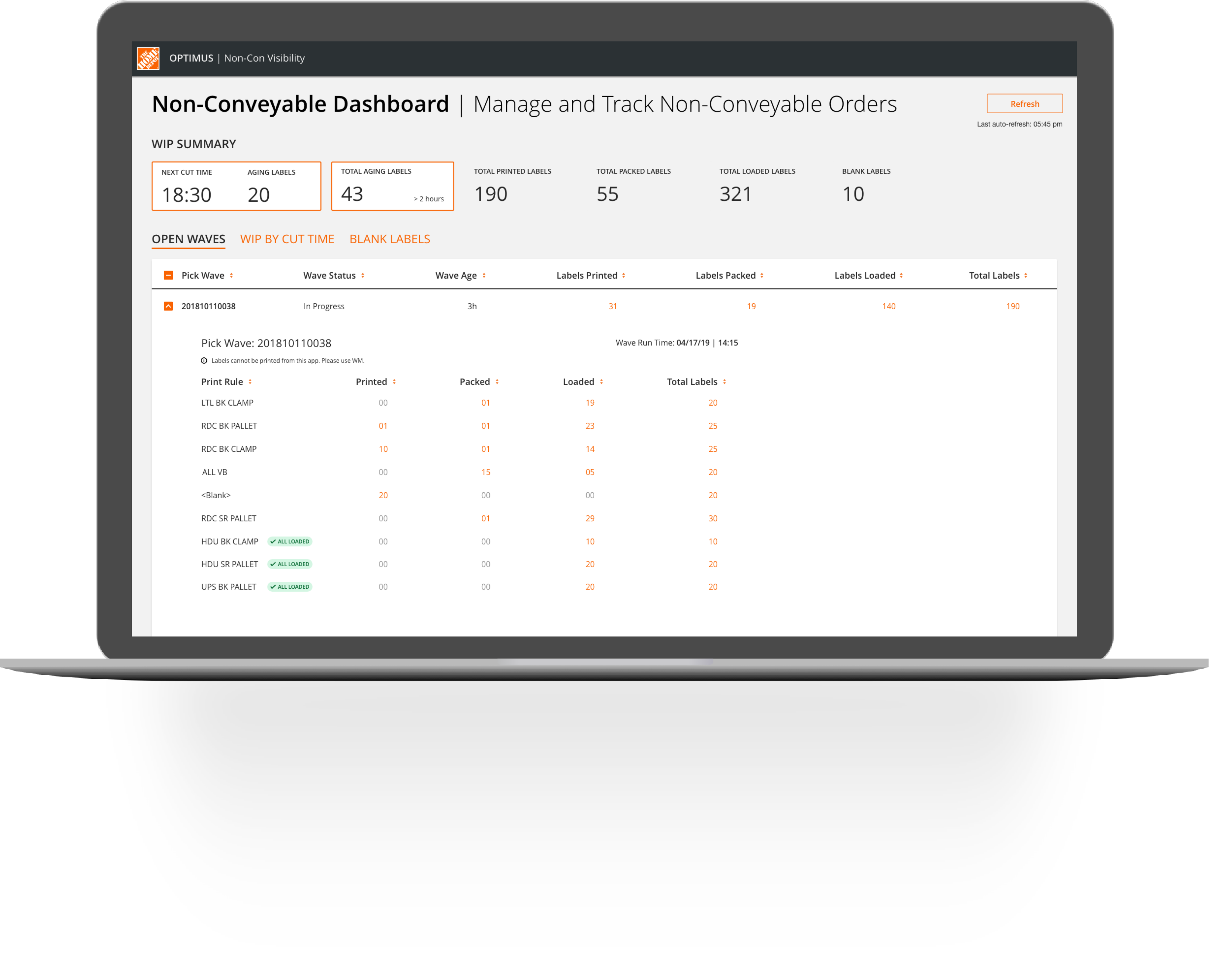
Non-Conveyable Dashboard
An enterprise app that aims to improve the operational efficiency of outbound work assignment and tracking for the Supervisors working in Home Depot’s fulfillment centers.
ROLE
Product Designer
RESPONSIBILITIES
User Research, Usability Studies, Interaction & Product Design
TIMELINE
May - Jul 2019
The Problem
Customer order picking within the DFCs were managed by Outbound Supervisors using a refreshable spreadsheet. The spreadsheet tools were not built with any security and posed security risks for the organization.
Along with this, there was no consistency in the process followed by supervisors across different buildings or even within the same building and the tools did not provide the users visibility to critical information to make
effective decisions.
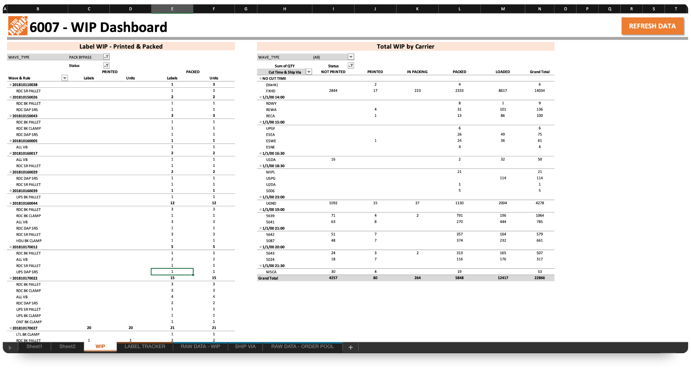
The Supervisors were using a slow and non-secure spreadsheet-based tool to manage outbound work in the fulfillment centers
Journey Maps
Contextual Inquiry helped us understand the mental-model of the Supervisors and the various touch-points that exist in their job of managing customer orders.

The Journey Map for Work Assignment and Monitoring.

The Journey Map for Researching customer orders with issues.
The Goal
The goal was to replace the existing spreadsheet-based tool with a cloud-based application that allowed users to carry out the same tasks with equal or better efficiency. No new features or process improvements was within the purview of the MVP.
How might we create a secure, centralized solution that allows the Supervisors to manage and track customer orders efficiently?
Hypothesis
By providing a cloud-based tool to the Outbound Supervisors at the DFCs, we will be mitigating the security concerns associated with the current spreadsheet-based tool without any negative impact to the productivity of the building. We will know this to be true when we see a 100% adoption of the new tool without any impact on the efficiency of the outbound process.
Further Research
Due to various priorities, the team had a 3 months deadline to deliver the new solution. To make the best use of time, I ran a week-long design sprint at a Home Depot Fulfillment Center. The sprint included a developer from the team,
the business owner and two users from different Fulfillment centers.
During the first couple of days of the sprint, I facilitated various activities to familiarize ourselves with the process, the people, their behaviors and the problems they face.
Methods Used
Contextual Inquiry
User Interviews
Card Sorting
Research Insights
Some of the key findings from our research were:

Redundant processes were stressful
The lack of automation required a lot of repeated, redundant interactions with the tool throughout the day resulting in stress.

Supervisors spent less time with people
The supervisors wished they spent less time with the tool and more time with the associates building relationships and helping them be successful.

Spreadsheet tool was slow and reactive
The tool did not provide users visibility to critical information when they needed. The users had to preemptively seek information.

Constant Context-Switching
The supervisors had to constantly switch between 3 different tools all day long, causing fatigue.
Icon Credits: Andrey Vasiliev, Graphic Tigers, Iconoci from the Noun Project
“Hitting the Refresh button 6000 times a day is a pain in the a**."
"It's stressful as we get closer to the cut times because sometimes customer orders are not loaded and I have to do a lot of research to find and fix issues."
Defining The User
From the research learnings, I created a user-persona to consolidate the users’ needs, goals, process, pain-points, and behaviors.
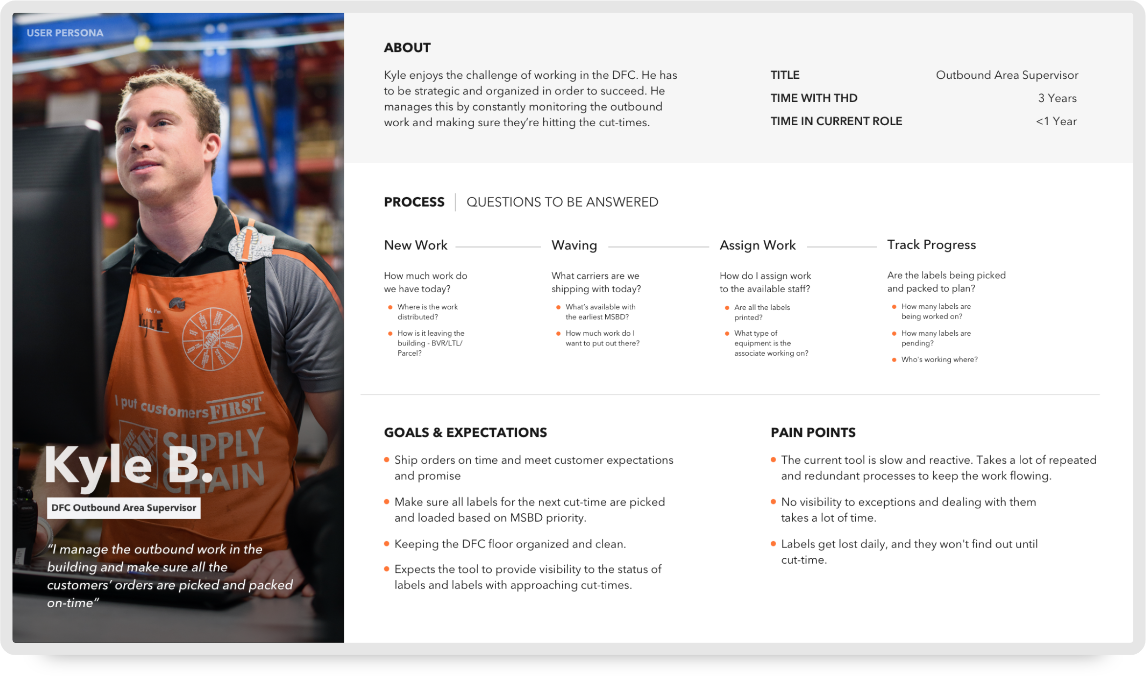
The persona of an Outbound Supervisor within a fulfillment center.
Ideation
Card Sorting
The ideation process began with card-sorting. The goal was to identify what information within the Excel tool that the supervisors were using was important for them to be successful and the order in which they prioritized that information. This was done by first identifying the key pieces of informaton and having the supervisors stack rank and categorize them.
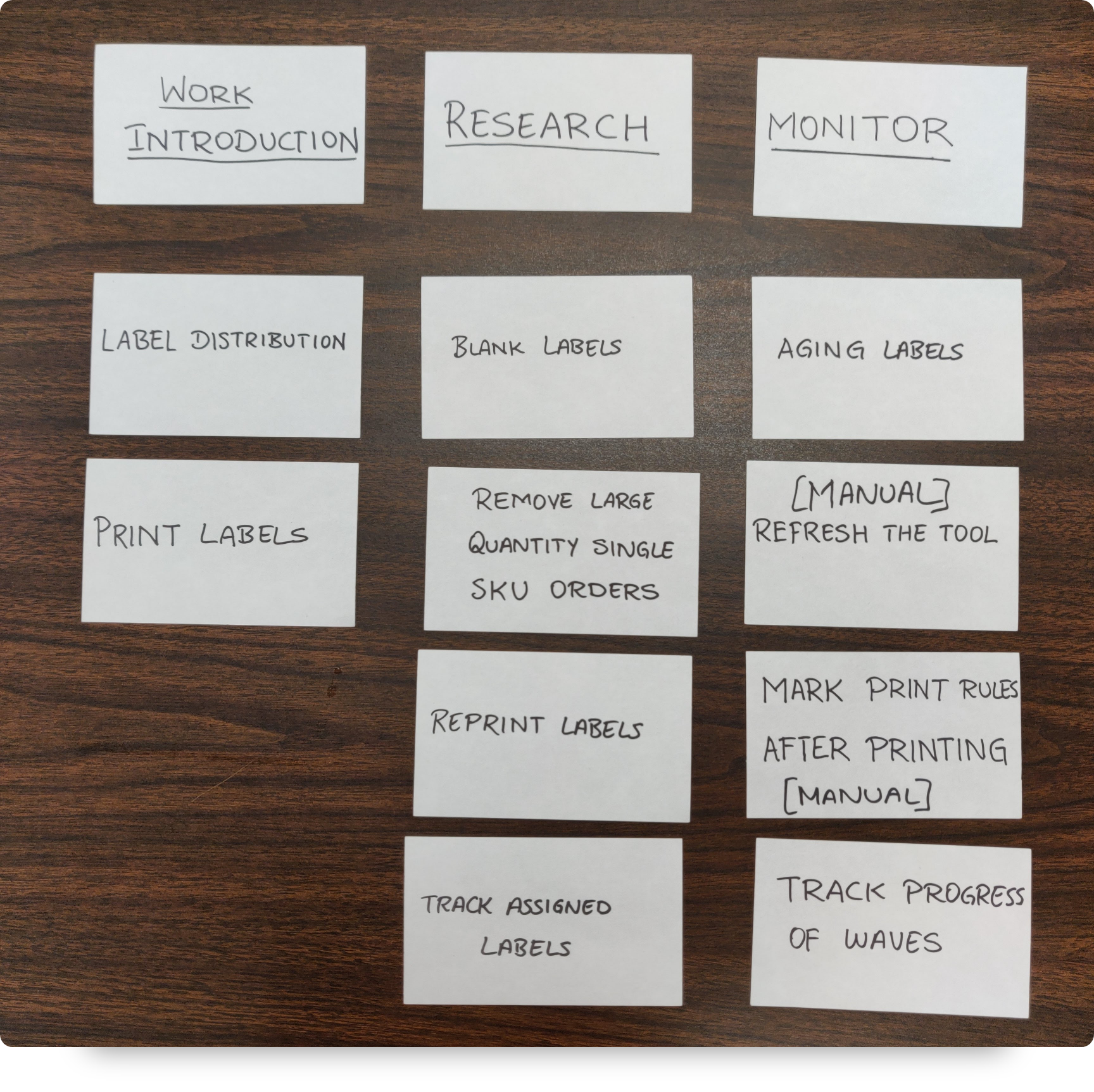
Card sorting exercise helped us understand the key pieces of information and how the supervisors organized them.
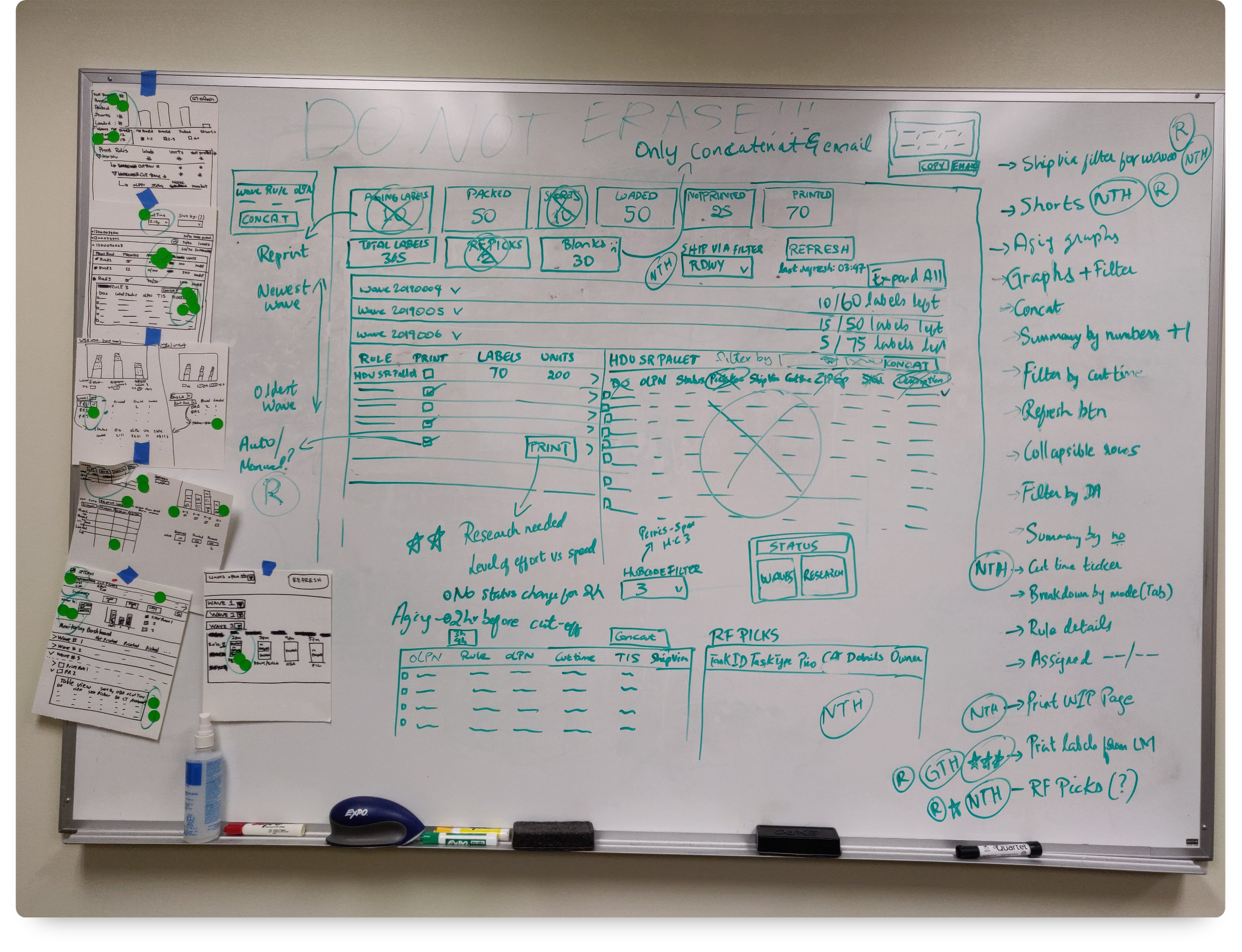
Whiteboarding
I facilitated a whiteboarding exercise with the team to explore ideas to solve for the prioritized goals and user needs. During the process, I tried to keep the conversations focused on the MVP and created a parking lot with a list of Nice-to-Haves.
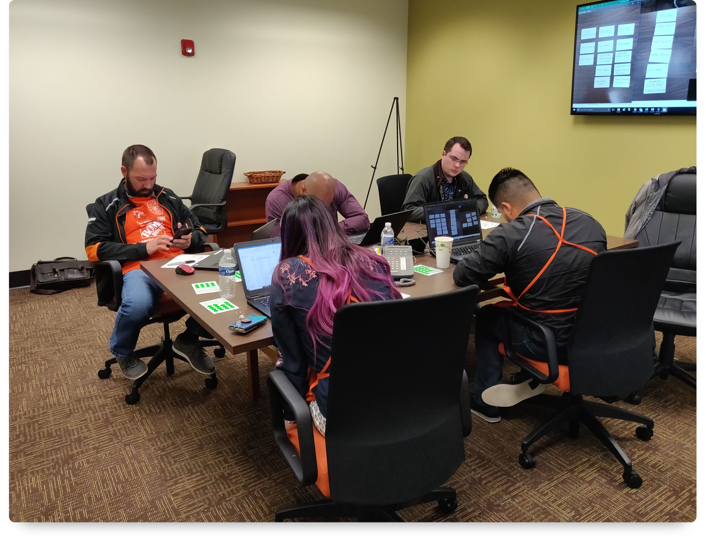
The team participated in a sketching exercise where each person come up with multiple design ideas to address the prioritized problems.
The team participated in a sketching exercise where each person come up with multiple design ideas to address the prioritized problems.
Wireframes
The Design Studio gave me a skeletal idea of the solution and I created digital wireframes to address the top user needs and goals.
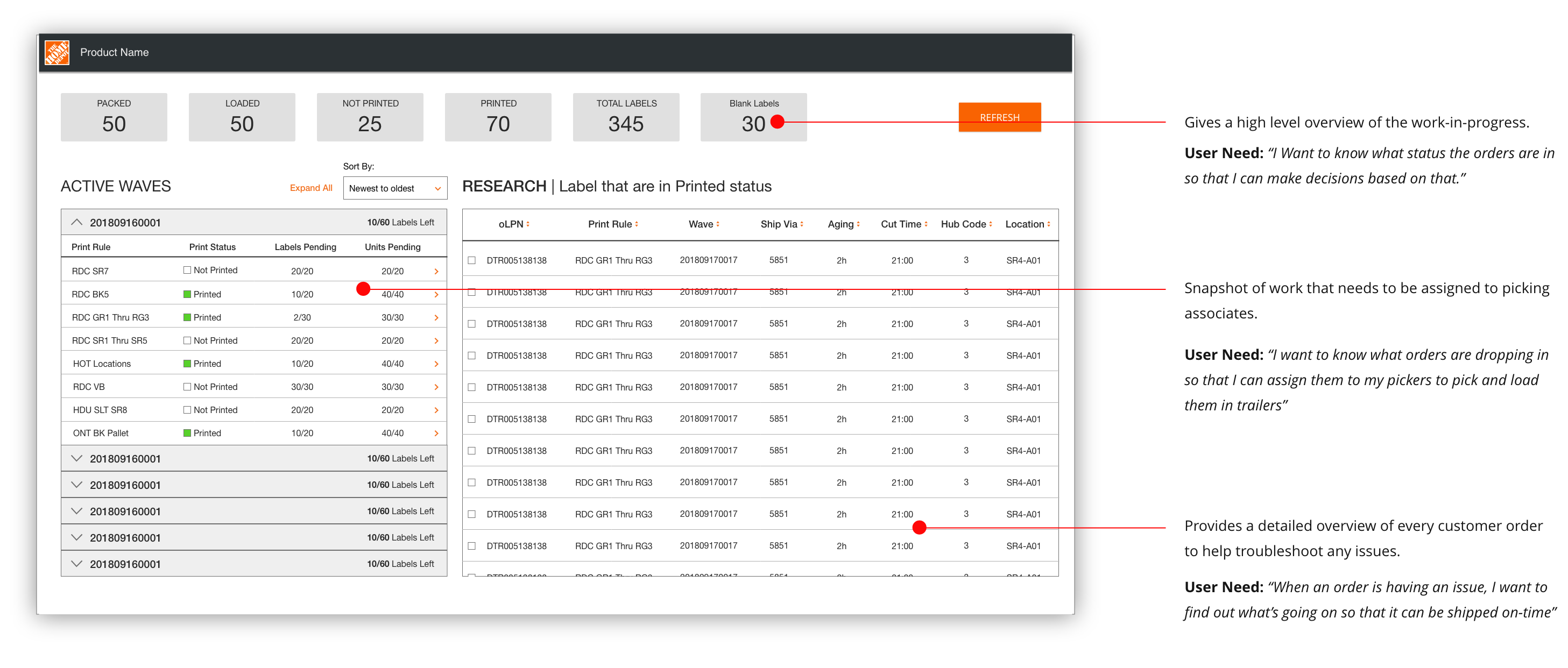
The ideas explored, sketched, and prioritized during the Design Studio informed the first digital wireframe.
Usability & Iterations
We conducted a series of usability studies over the next couple of weeks to test our solution hypothesis and iterated based on the learnings.
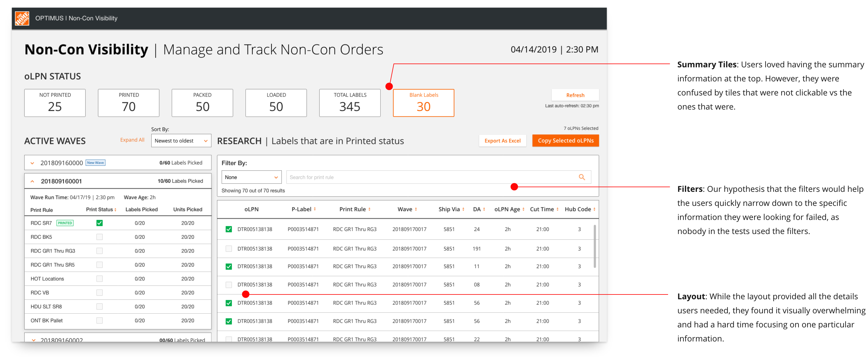
Usability studies helped us validate our solution hypothesis and identify areas of concern or delight.
Final Design
From the study, we learned that users cared more about specific research and not open-ended research as we initially believed. Based on this, I iterated on the designs to match their mental model more closely. The outcome was that users were able to take actions more easily and there was less ambiguity in what they could interact with and what they couldn’t.
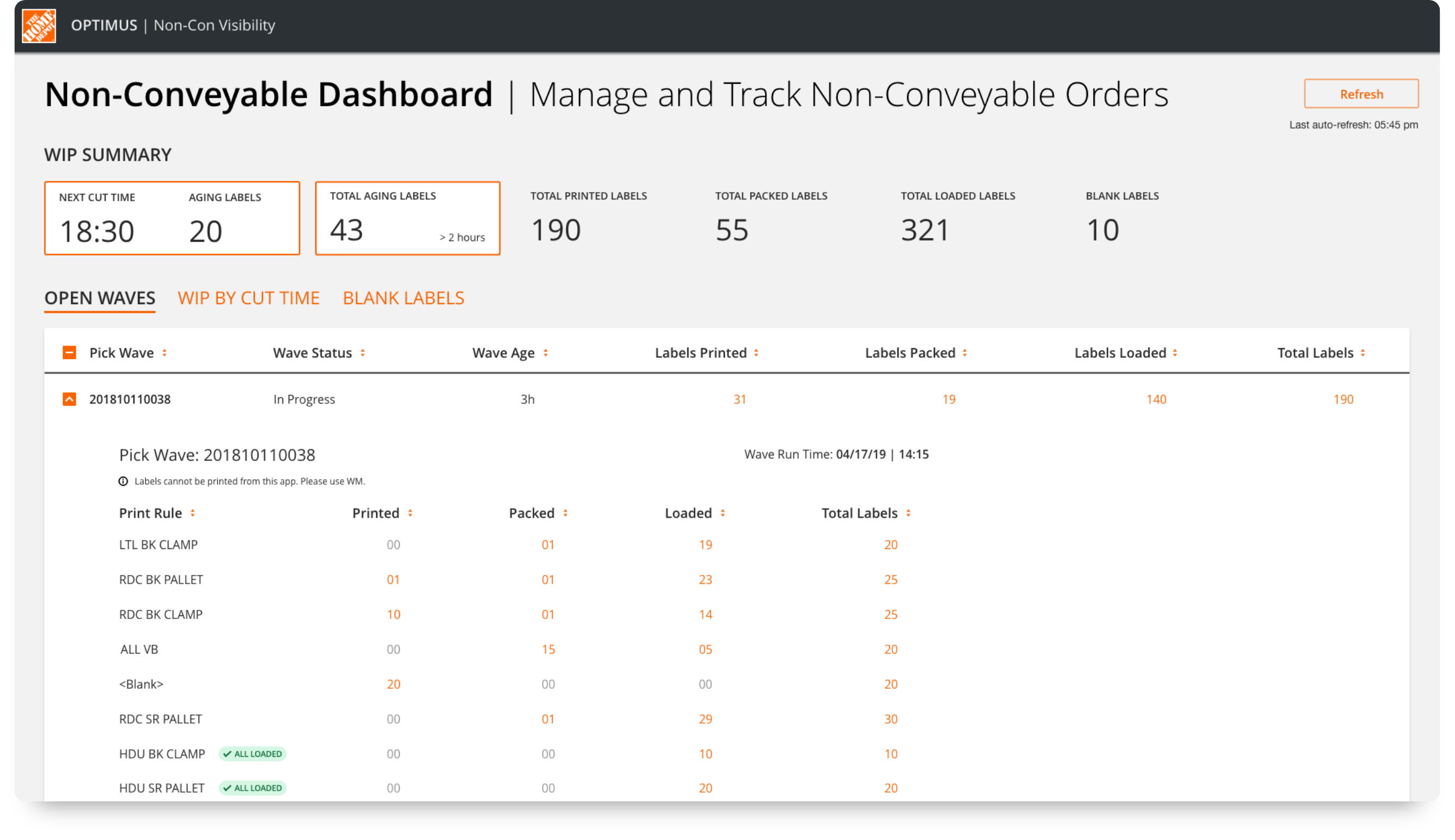
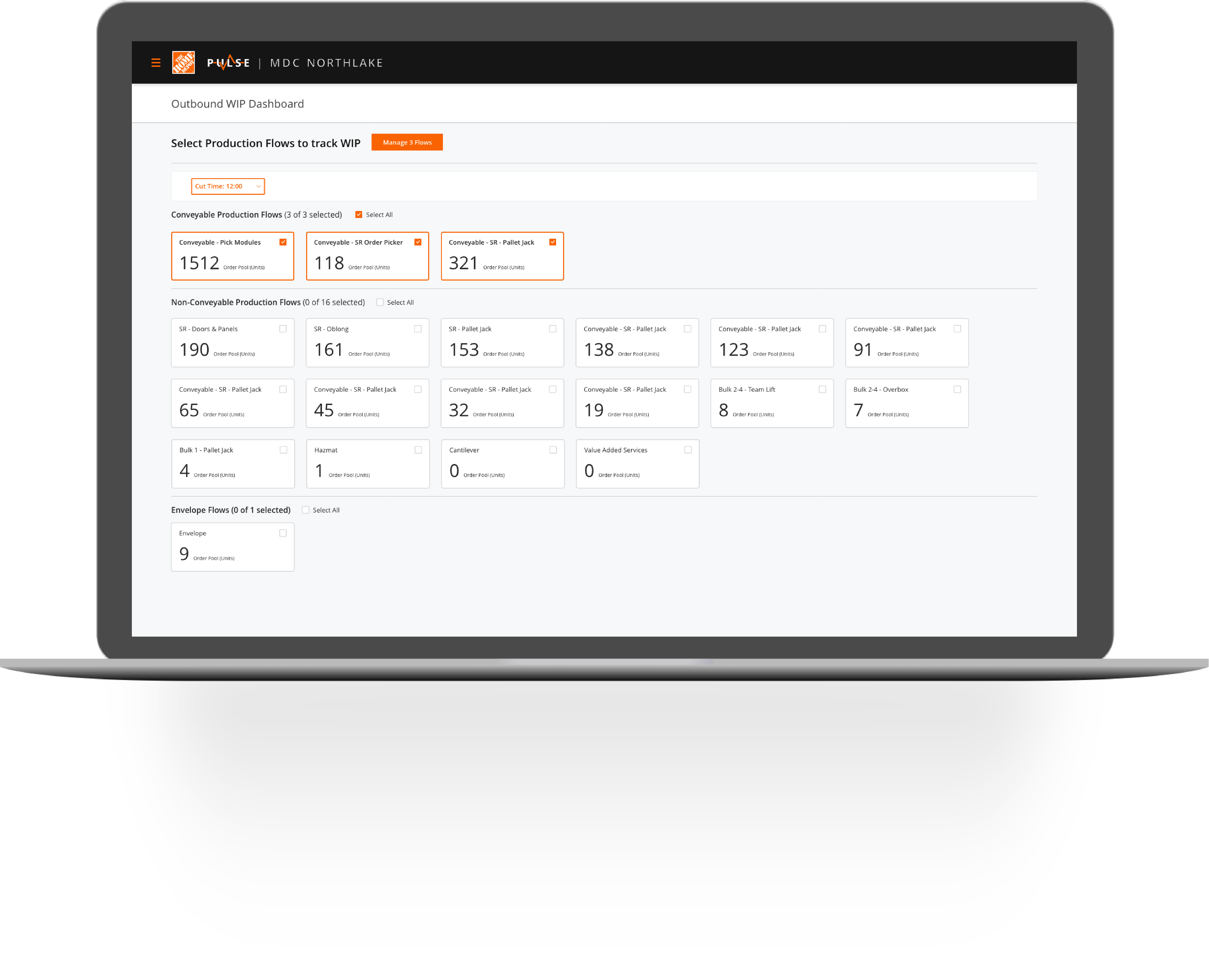
A cleaner looking landing page that matches the users' mental models more closely.
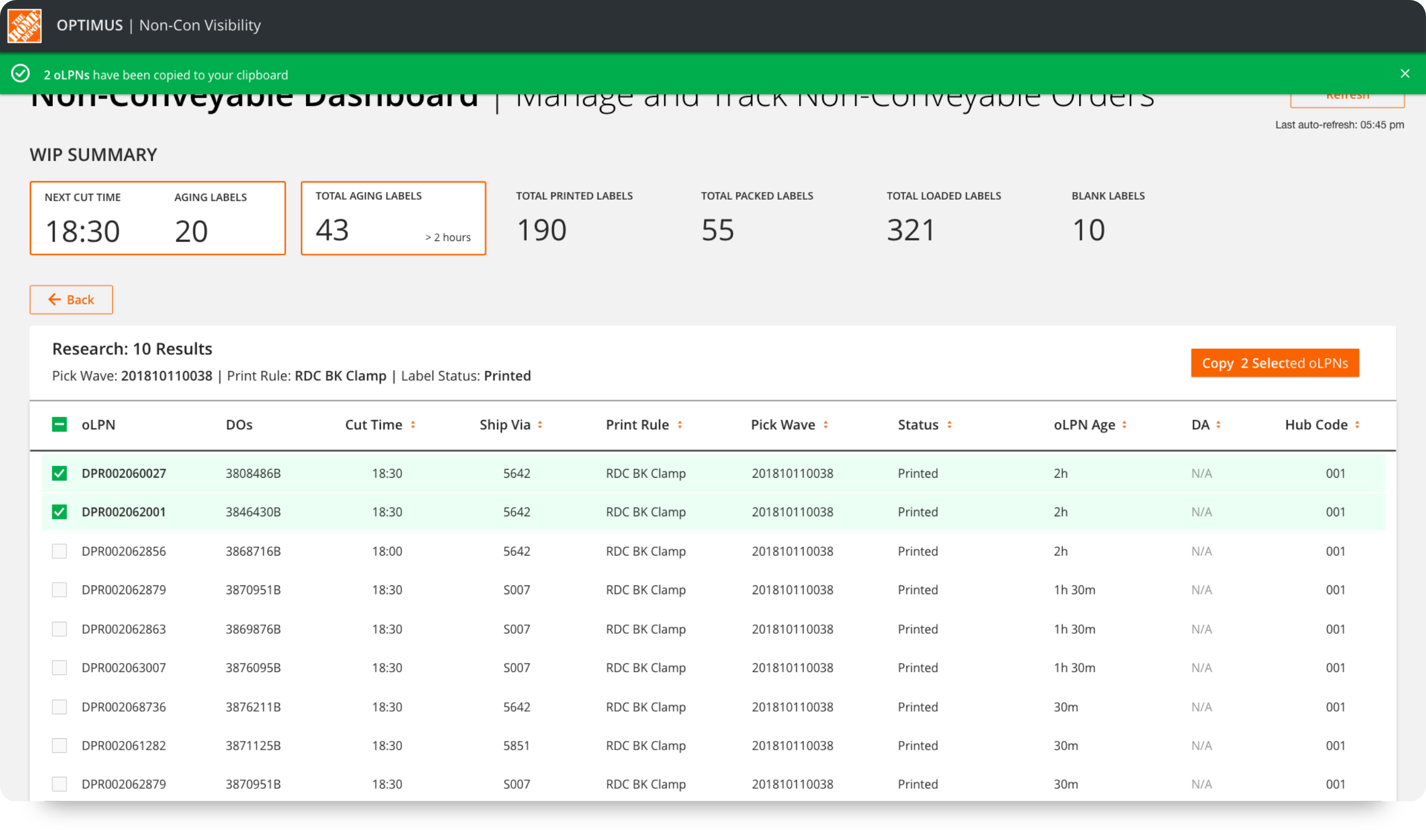
The research section is moved from the front page. This offers a more focused view of the information users need.
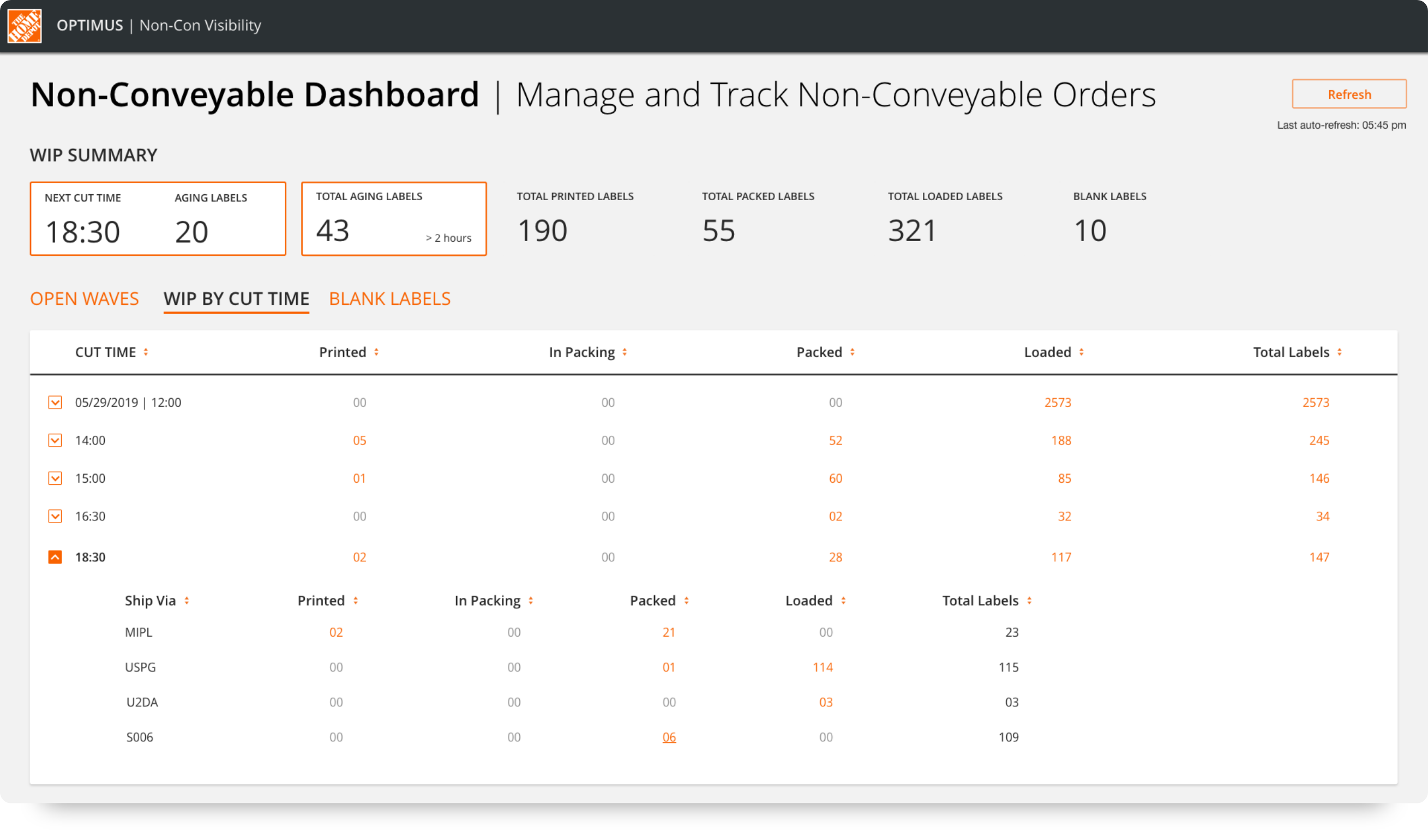
Showing work by different cut times helps users prioritize the work accordingly.
Orders with exceptions are grouped together so that suitable action can be taken.
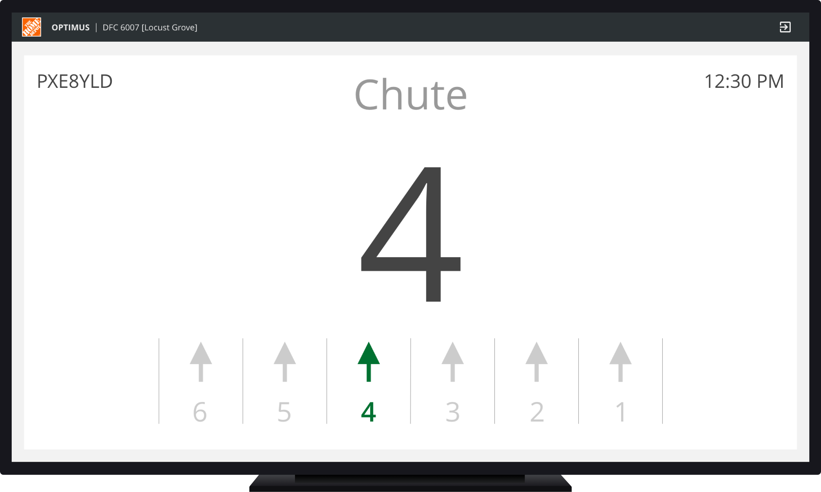
The final prototype showing the user journey and the transitions.
Outcomes
The outcomes of this effort were:

Faster data loading
Through automation and new data architecture, data loading was drastically increased. Updates happen almost real-time without a manual refresh.

No training needed
The supervisors were able to get started using the app with no to very little software training necessary.

Less context-switching
The concatenator tool was completely removed from their workflow, thereby reducing the amount of Context-Switching supervisors had to do.

Design ⇨ Ship
Thanks to some great collaboration from everyone involved, the app went from research to live in 10 weeks, well ahead of the schedule.
Icon Credits: Musmellow
The efficiency of the Supervisors and their decisions directly impacts The Home Depot's online shopping experience and the tools they use directly impacts the building's efficiency. As a result, it was very important for us to make
sure we
provide
the Supervisors with a tool that makes them feel confident using while improving their efficiency and security.
When we tested the final version of the app, the users felt comfortable and confident using the new app. They were able to run the operations smoothly with very little to no
training needed and this
was a huge win for
us.
“I love that I don’t have to use the concatenator tool anymore”
“The app is pretty self-explanatory.”
Some aspects of the project, like the remote usability studies, could've gone better. Nonetheless, these issues were minor and didn't derail the project. I managed to stay focused on the MVP and included all stakeholders in the
entire
design
process
which
made this project a successful endeavor.
Working on this project gave me a lot of
confidence in runnings design sprints and making big design
decisions.
Other Works
Designed & Coded by Setu Kathawate © 2019