Pulse Dashboard
Pulse is a software platform built from the ground up to provide operational visibility to the leaders of The Home Depot’s next generation fulfillment centers.
Role
UX Strategy
Ensuring the outputs (UI/Dashboard) connect with the business outcomes (faster shipping and delivery) and match the users’ mental model.
Solving the right problem
Led the research efforts and visited THD’s warehouses several times to observe and understand the operations and the leaders’ behaviors, motivations, fears and goals which informed the design decisions.
Interaction and Visual design
Worked with another UX Designer and designed the UI flows and interaction patterns to visualize complex information in a meaningful way.
Project Background
Home Depot has been investing in next generation fulfillment centers with a more streamlined supply chain operations to meet the Same-day / Next-day delivery expectations to its online and pro customers. To help the facility leaders manage the operations within the building, the business needed a new dashboard to provide necessary operational visibility.
Problems
01. Fragmented legacy software ecosystem
Information was scattered across 5 different apps and multiple reports in the legacy software platform. Along with this, the legacy software was not built to provide the right operational visibility to the newer facilities. The leaders had to spend 15-20 seconds to take action on a single customer order, which at scale, was unacceptable.
02. "We need a faster horse"
At the time of research there were no next-generation facilities that were fully operational. As a result, nobody knew what to expect during full volume scenarios and there were a lot of assumptions flying all around. The challenge was to differentiate between what the business and users really wanted and what they said they wanted.
Process
Given the broad scope of the problem, the research and design process mainly involved a lot of trips to the fulfillment centers to understand the business and operations, a lot of interviews and asking Whys, and a lot of back-and-forth ideation and evaluation of hypotheses.
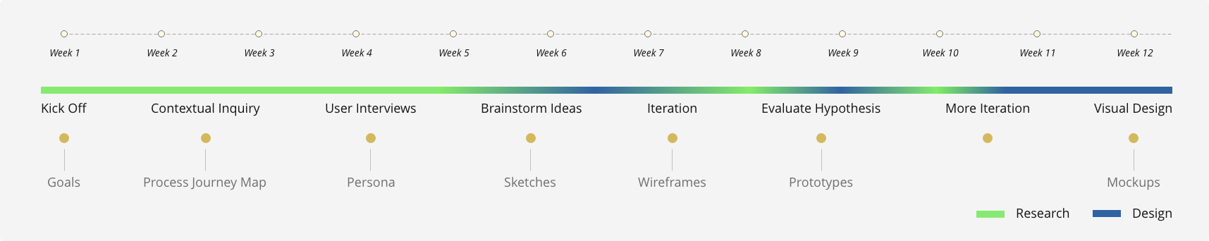
The research and design process timeline with outputs.
What Success Looks Like
The main goals the business wanted to achieve with this initiative were:

Reduction in redundant roles
The legacy buildings had multiple people assigned to different tasks because there were multiple dashboards to manage. This problem had to be solved.

100% Cut Time SLA
It's critical for the business to ensure all customer orders are picked, packed and shipped out of the building before the trailer leaves.

Single source of truth
To ensure consistent and predictable decision making, it was important to have a single source of truth for all the leaders to access and agree upon.

Ship MVP by Mar '20
The first of the new, fully-operational buildings were expected to go live by March 2020 and the software had to be ready to support the operations.
Icon Credits: Guilherme Furtado, Rafael Garcia Motta, Gautam Arora from the Noun Project
Research
To learn more about the users and the operational processes, we made multiple trips to an existing facility in Chicago and shadowed them as they managed customer orders. The biggest need for the leaders were:
01. Order pool visibility
What is the order pool density?
How many units are in each region of the building?
How much work do I have for the next approaching cut time?
02. Tracking work assignments
Are all the orders getting picked, packed and loaded on-time?
What orders have issues that require troubleshooting?
Ideation
How might we help the MDC leaders make the right staffing decisions based on what’s in the order pool and ensure all customer orders are loaded on time?
Having understood the operations and the leaders’ mental model, we had clarity on what user-problem we were trying to solve. Through a series of sketching and whiteboarding sessions, I was able to quickly brainstorm ideas to answer the questions and uncover more questions that we needed further understanding on.

Designing For Behaviors
While showing all the order/region status information to the leaders sounds like a good idea at first, it’s counter-intuitive. It would overwhelm the leaders with too much information and there’s a risk they might miss something. It
was important to understand what actions they take, when and what information helps them take those actions.
The answer lied in their behavior - Each leader would manage a certain part of the building and they would focus on order status within their regions for the most part. However, occasionally they’d jump in to help other leaders if
their regions are doing well / low on work.
Hypothesis : Progressive Disclosure
To afford that behavior, I thought of showing information in layers - Allowing the leaders to choose the regions they’re working on but also provide visibility to the status of the other regions on demand.
We believe, by showing leaders the status of the regions they’re in charge of, they will be able to make better staffing decisions and troubleshoot issues quickly.
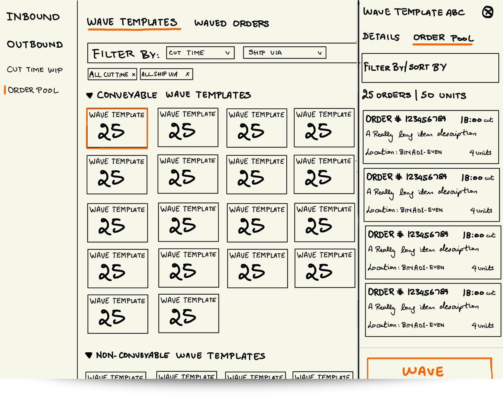
Design Explorations
We explored multiple ways to visualize the order pool and picking status information through progressive disclosure and different header styles showing overall building status.

Testing the Hypothesis
It was a challenge to balance information density with the level of useful detail. Along with that, we also had to keep the MVP goals in mind and not get carried away by designing too many things in the first iteration. Thirdly, we wanted to maintain visual consistency with the other existing apps and not design too many new patterns and interactions. After multiple iterations and careful design and engineering considerations, we had arrived at our solution hypothesis that we tested with the leaders at a THD warehouse. The testing helped us identify the gaps in usability and data shown.
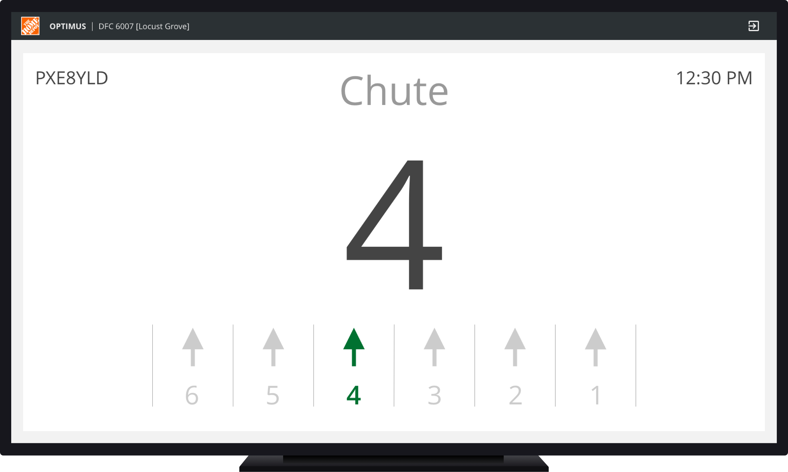
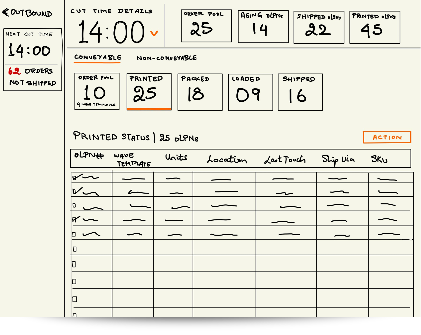
Region selection
“Do all orders in the regions have the same cut time?"
The prototype showed all the orders in different regions but the leaders look at the work by the earliest cut time so that they know what areas of the fulfillment center needs to be prioritized.
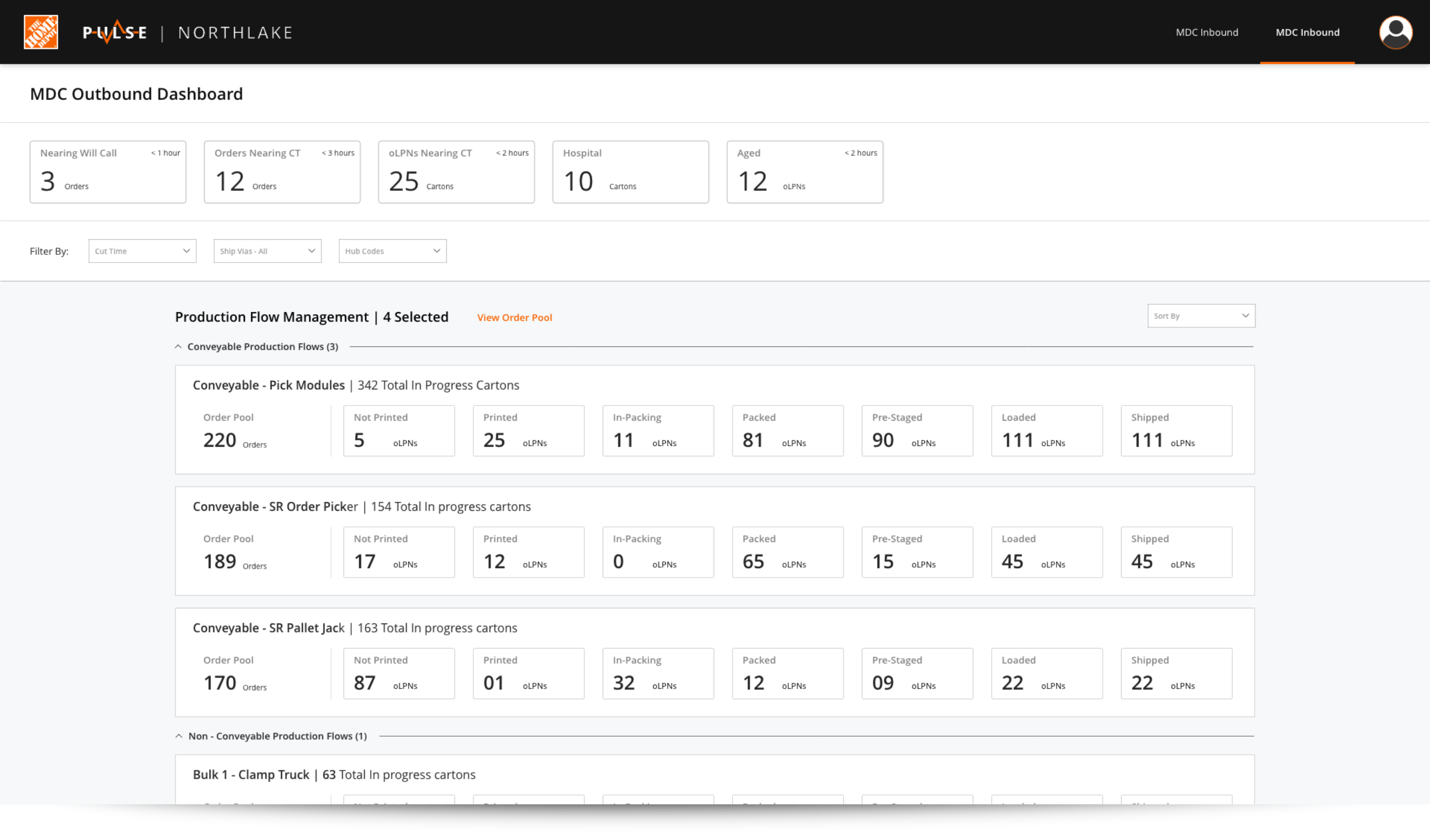
Work Management Dashboard
“As an Ops Manager, I check the pulse of the entire building 4-5 times/day to make sure everything is flowing correctly”
While the cards made it easy to scan information and provided generous seperation between different regions, the senior leaders in charge of the entire building said they keep track of all the regions within the building and the having to scroll too much would impede that need.
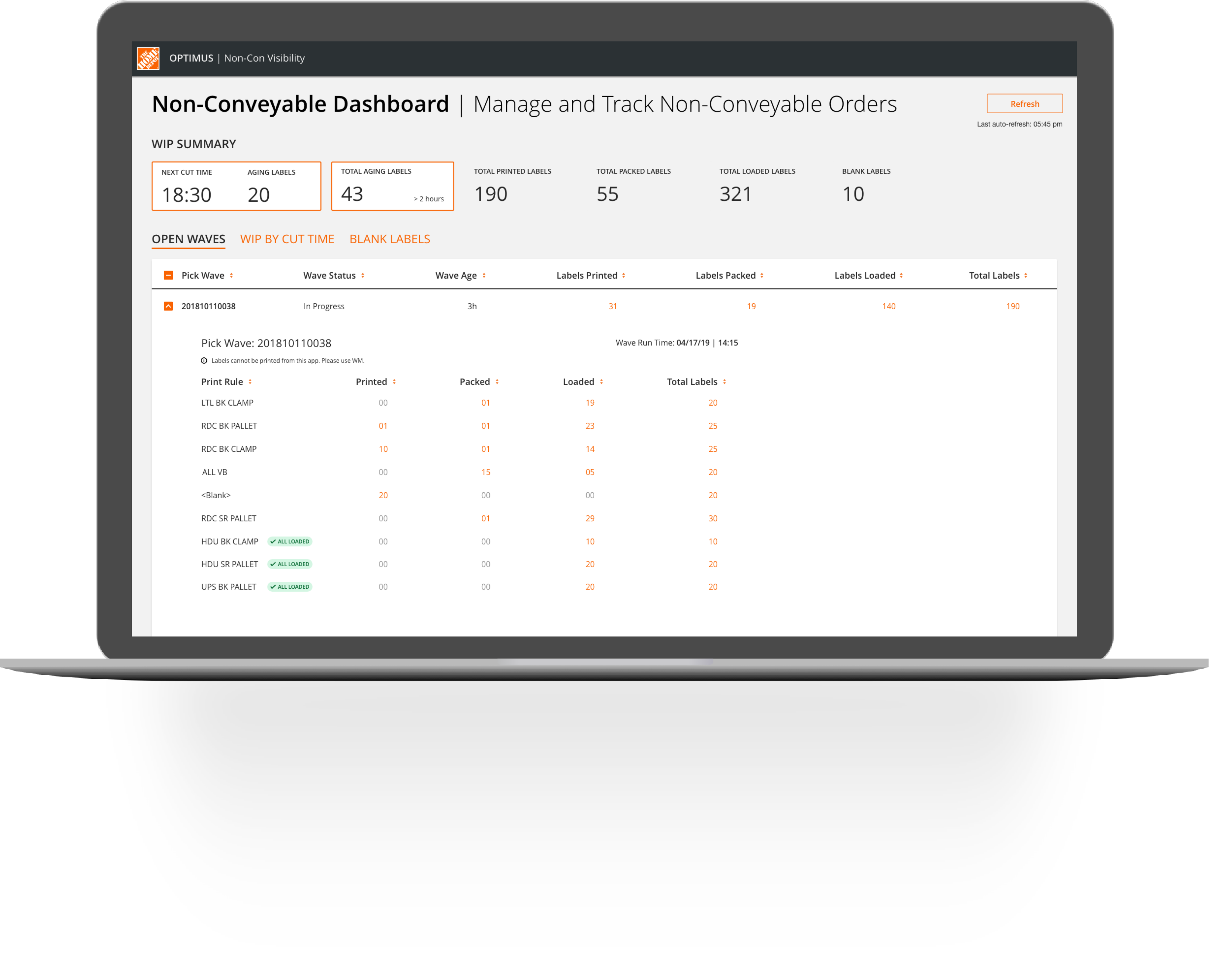
Final MVP Design
Based on the learnings from the studies, I made changes to our MVP hypothesis and created the final visual mockups using The Home Depot’s Pallet design system
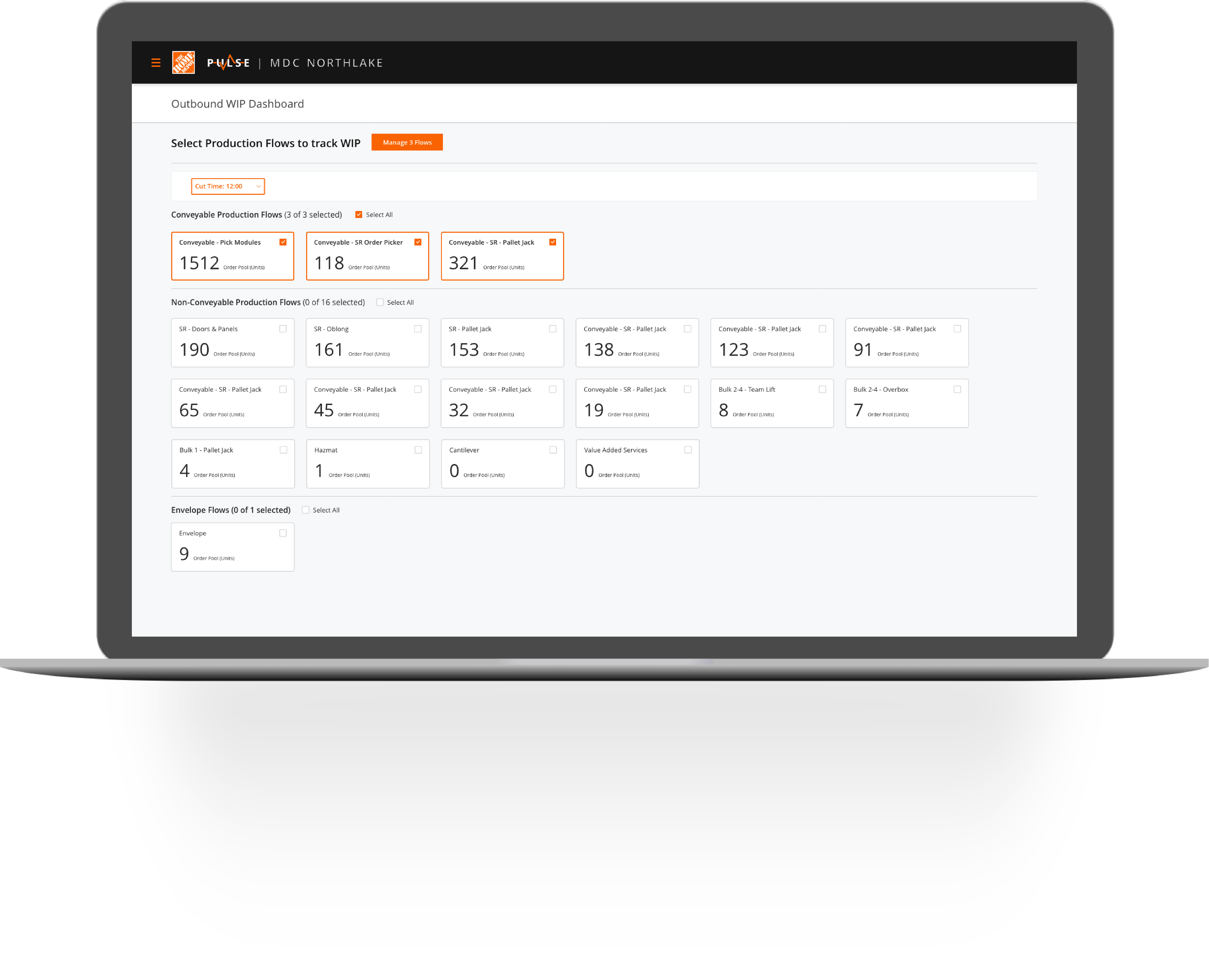
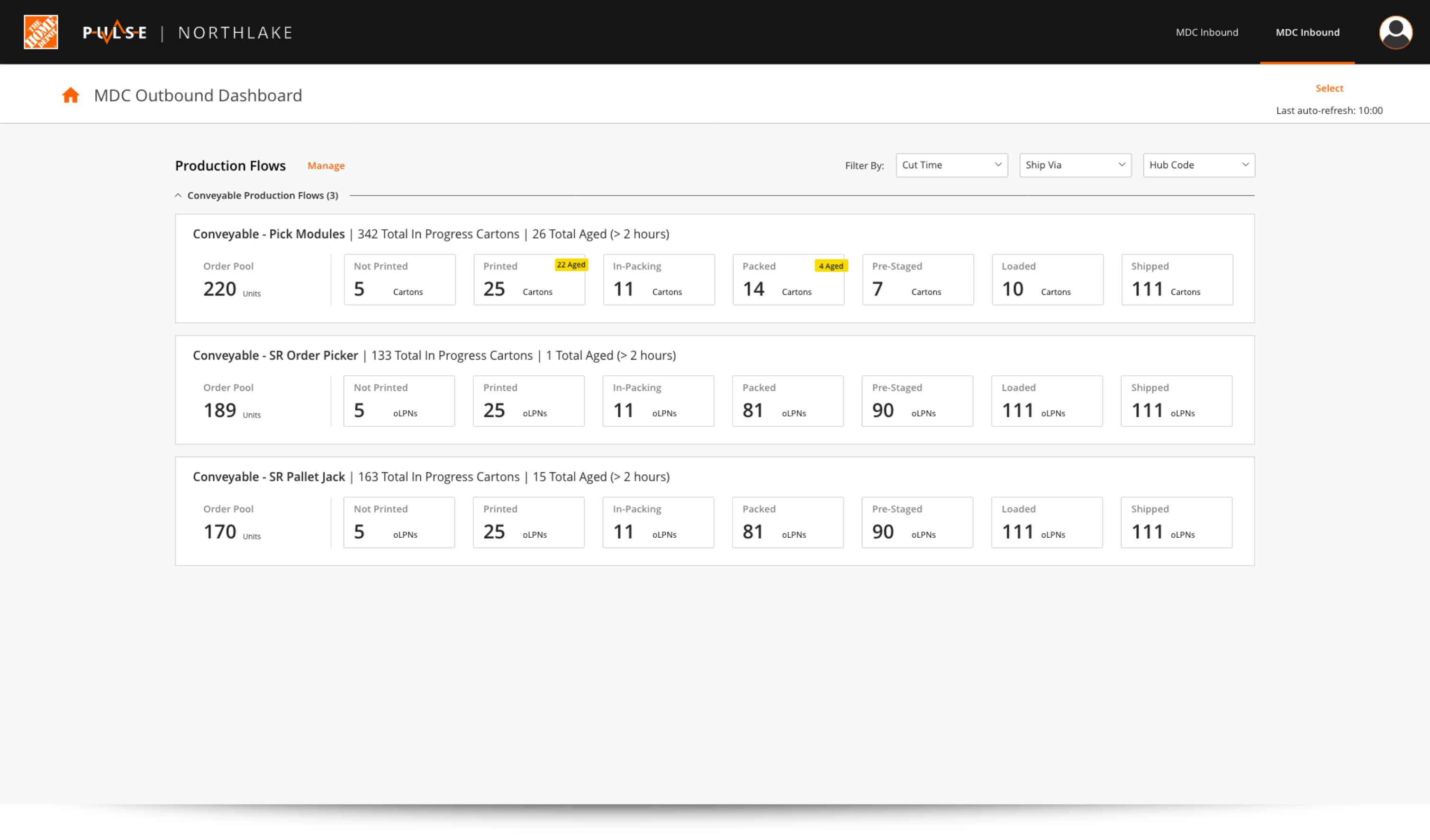
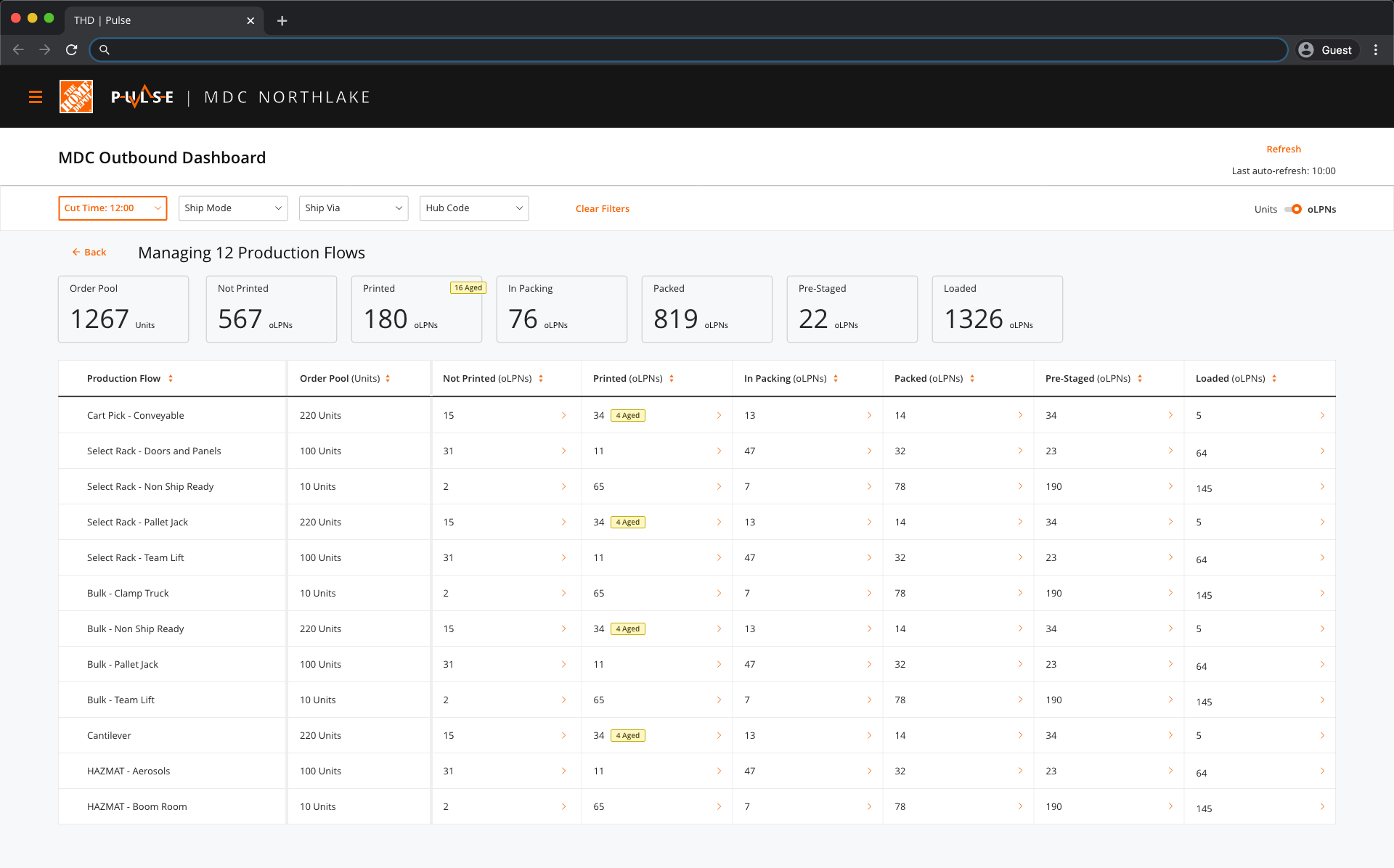
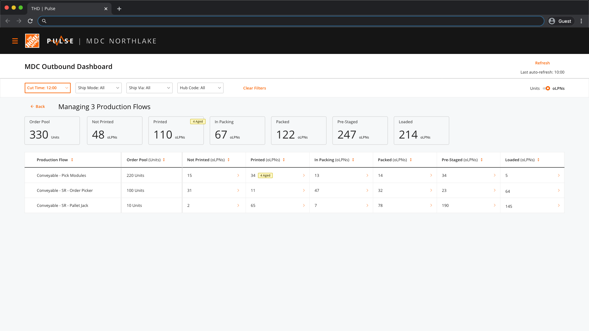
User Need 01 | View work by cut time
“I prioritize work by the next approaching cut time...”
Solution
A filter that allows leaders to see how much work is there in different regions for various cut times. Also, changed the screen from modal to a dedicated page since leaders spend considetable time monitoring information based on various cut times.
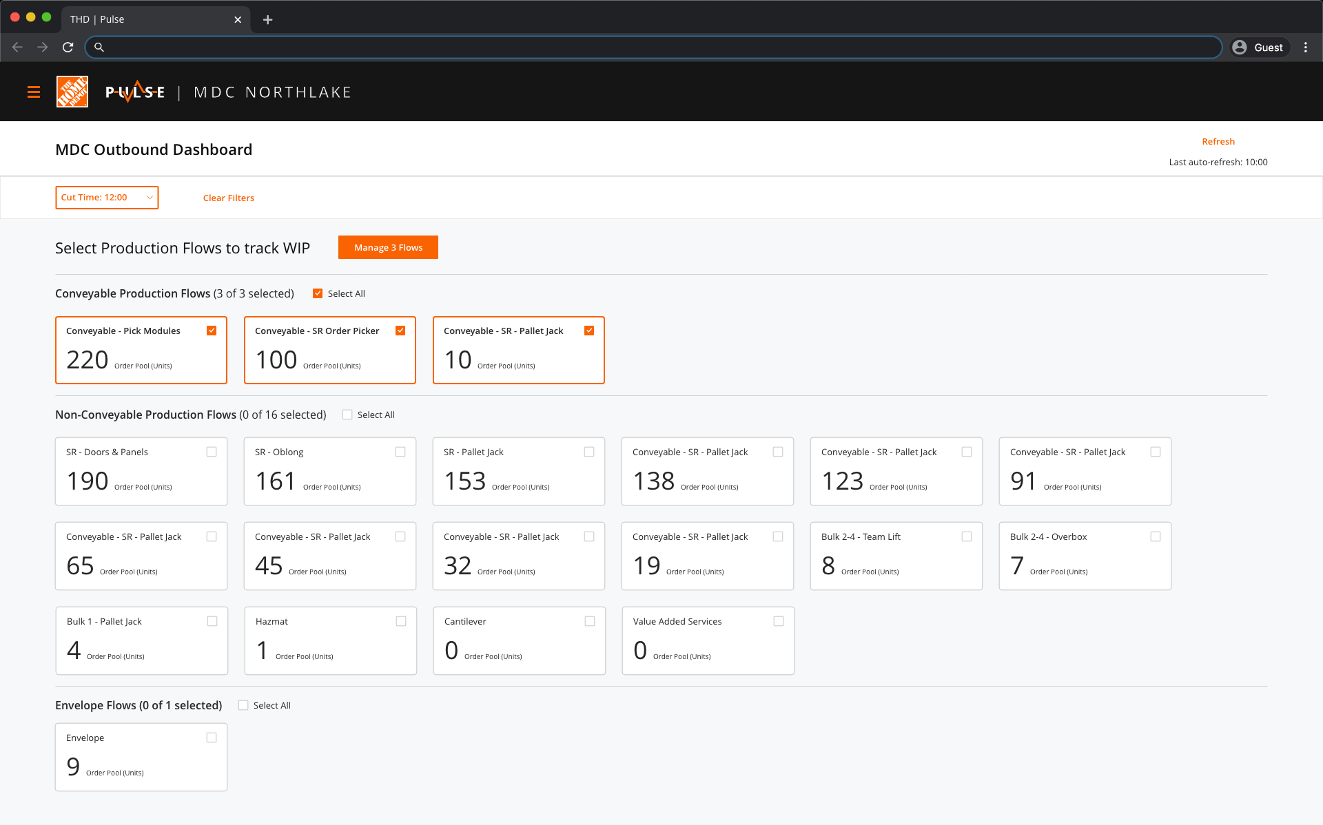
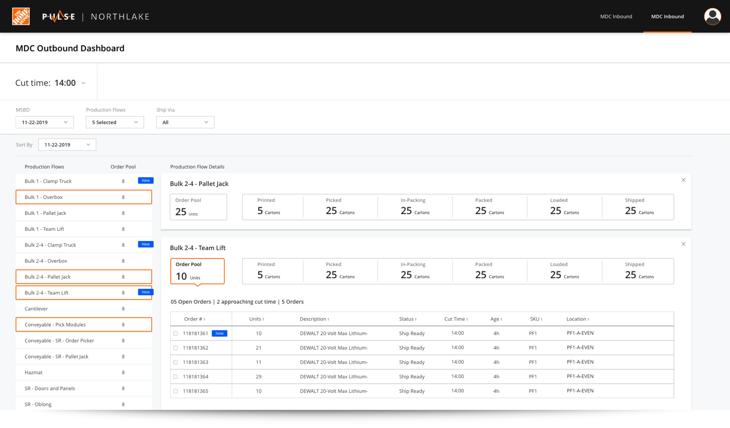
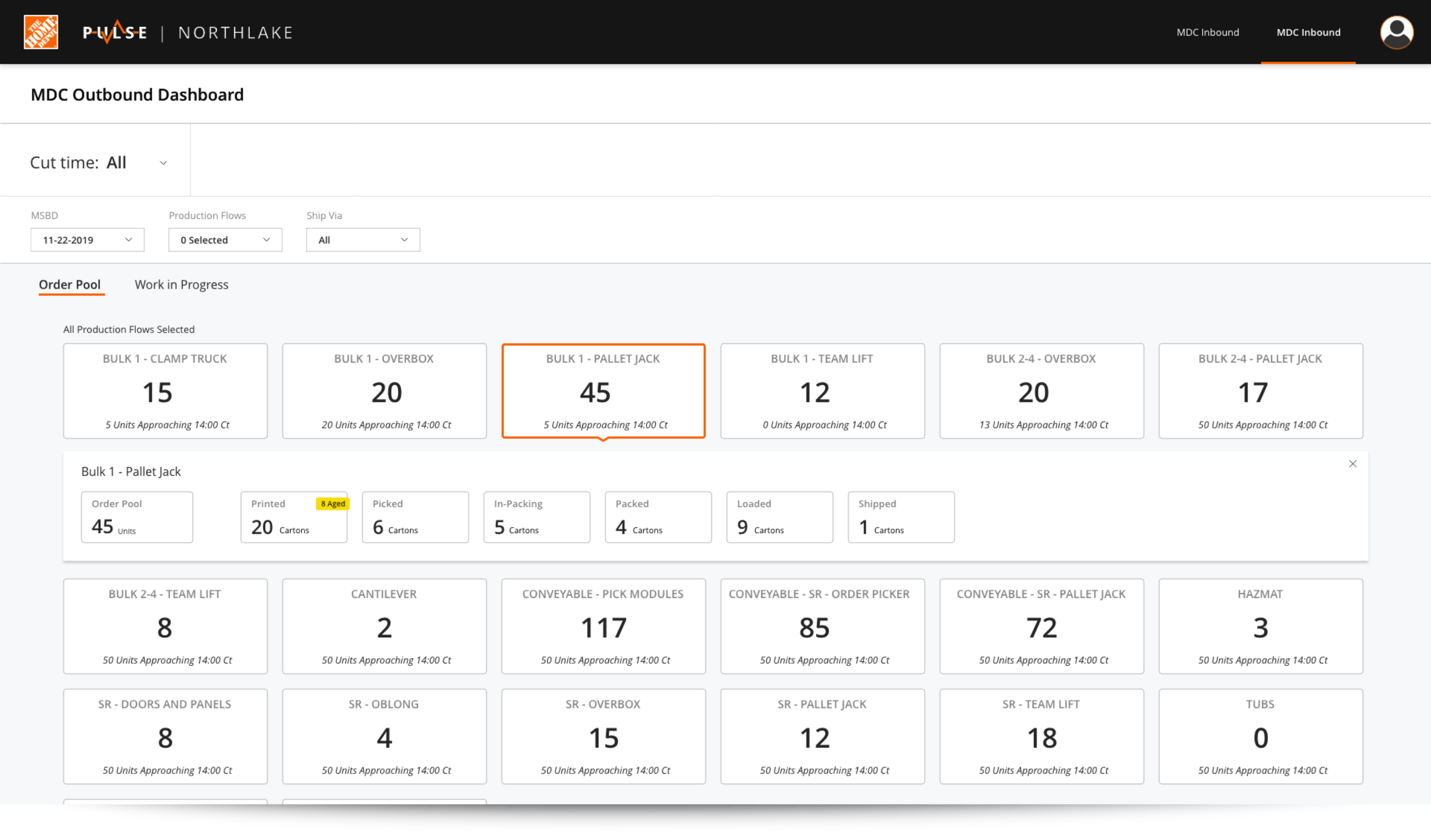
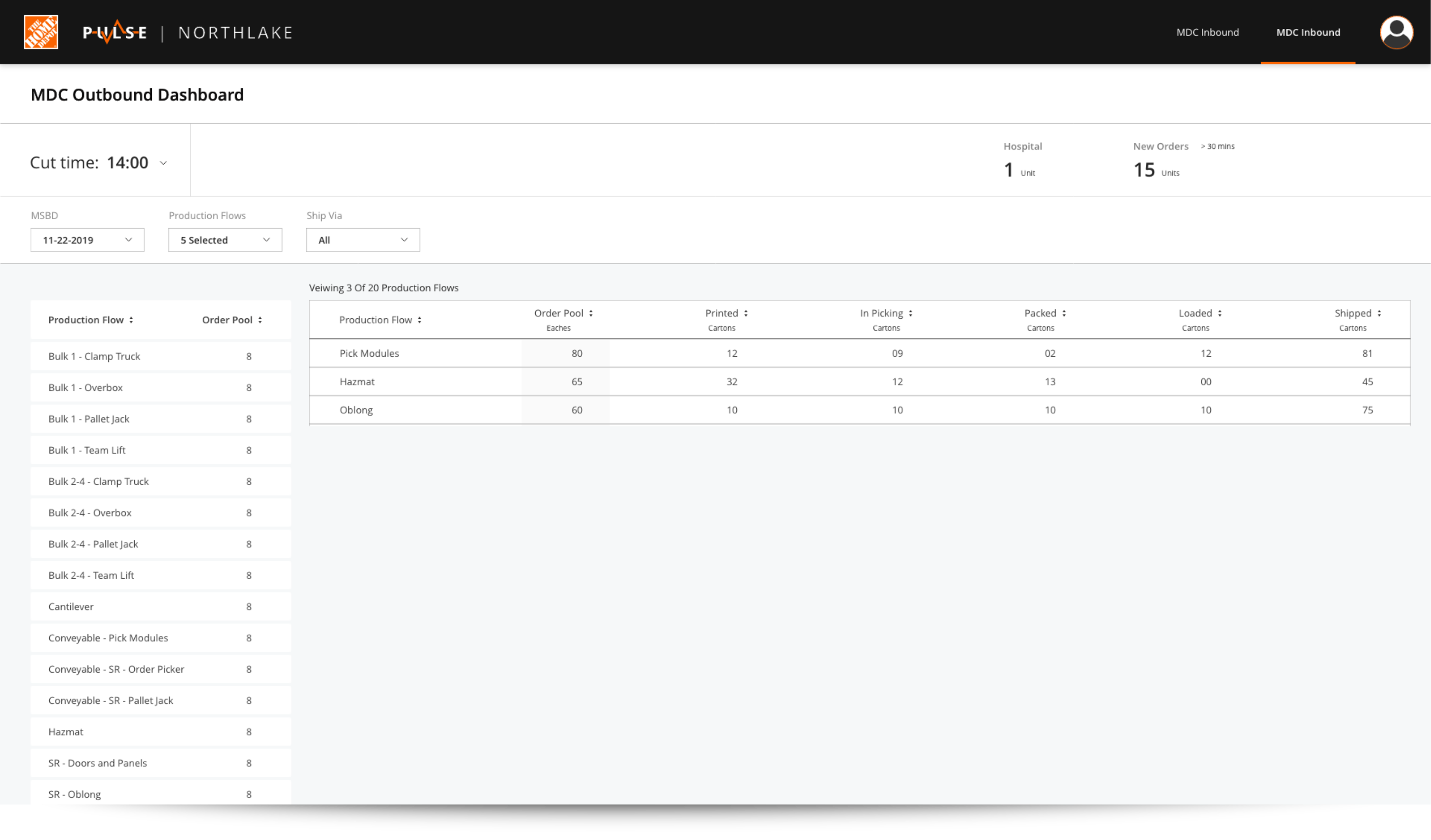
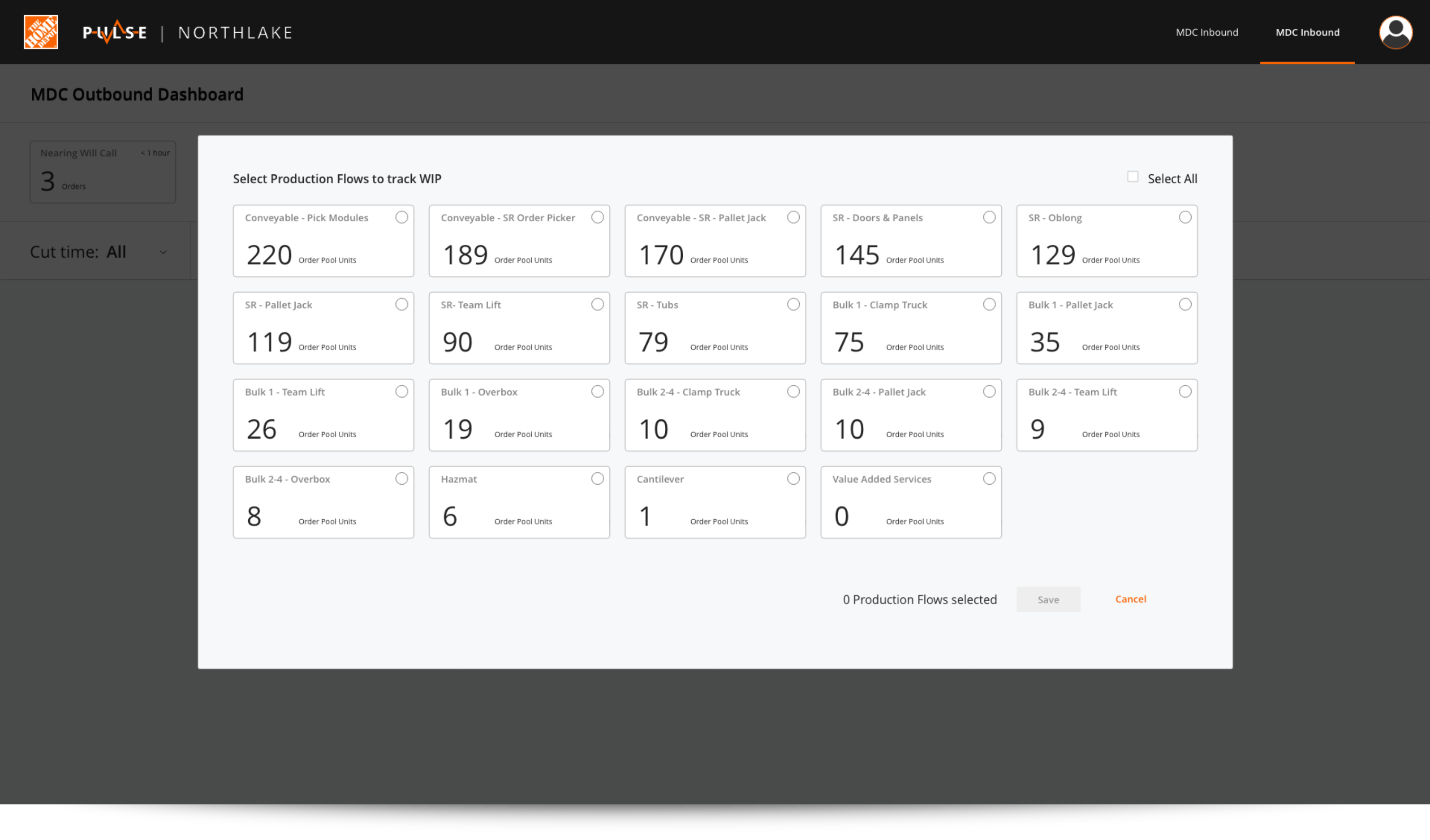
User Need 02 | Keep an eye on all regions
“I track all the regions within the building..."
Solution
Depending on the role of the leader (Operations Manager vs Area Supervisor), they would track the progress of work from different altitudes. Giving them control over what they want to see without overwhelming them with too much information or by not witholding any information was important. By allowing the leaders to select the regions they want to manage, this goal was achieved.
The Operations Managers care more about tracking the health of all the regions within the building.
The Area Supervisors care more about tracking the health of specific regions within the building.
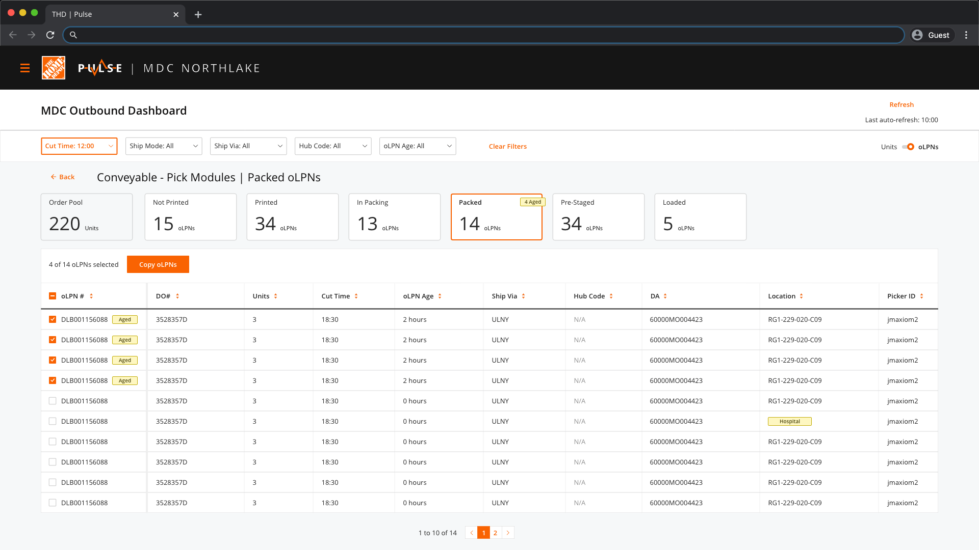
User Need 03 | Troubleshoot issues quickly
“It’s important to see the aging labels for an approaching cut time and who has those labels...”
Solution
Added additional filters that help the leaders narrow down issues quickly.
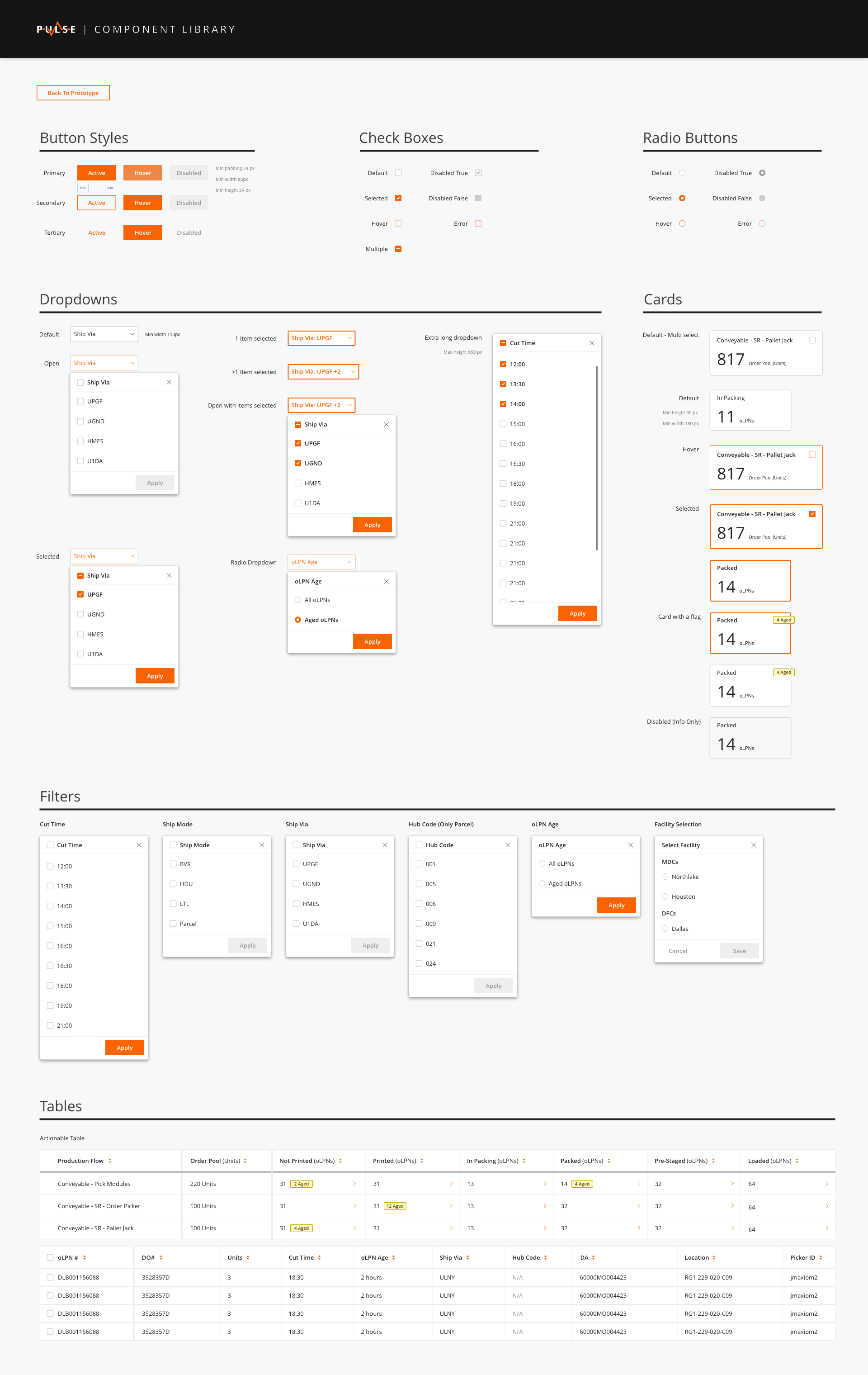
Defining The Styles
Using The Home Depot's Pallet Design System as the base, I created a style guide for designing the dashboard. Some of the components, like the status cards, had to be custom designed while others like button styles and dropdown menus were taken from THD's design system. I compiled all the assets in a single, interactive sheet for the developers' quick reference as they build the dashbaord.
Measuring Success
So we have the mockups ready, Great! But how do we know this is the right solution?
Despite all the testing and iterations, the MVP is still not used or even tested by the people it is intended to be used by and in an environment that it’s intended to be used in. But
eventually when it does go live, we’d measure success by looking out for some key indicators:
01. Task success
Can leaders find the order information for the regions they’re managing?
Can they successfully release work based on the information in Pulse?
Can they successfully track and troubleshoot issues?
02. Engagement & Time studies
Time taken to decide when to release work assignment
Time taken to research label status And troubleshoot issues post work release
Branding
Active listening is a key part of any research and it impacts every corner of the product. Quite literally in this case. During the interviews with the leaders, they frequently mentioned that they check the 'pulse' of the building when describing their goal. At the time we were looking for a new name for the platform and calling it 'Pulse' seemed apt. I quickly explored a few logo options and we settled on the one below.
Reflections
This was one of the most challenging projects I’ve had the opportunity to work on because of the ambiguous nature of the project. I started on this project with a clean slate and there was an ocean of information in front of me. This
project helped me improve my listening skills and find ways to separate useful information from the noise.
Staying curious and getting an intimate understanding of the operations and the leaders’ jobs helped me greatly. Through the process of inquiry and learning, I was able to gain insights into how the leaders work and what helps them
be successful which informed the design decisions.
This, by no means was a single-person job. I am also very thankful to my teammates and the leadership at The Home Depot who supported me through this effort. Good leadership starts with trust and I am glad my leadership allowed me to
work fearlessly and make many mistakes in search of the right answers.
Other Works
Designed & Coded by Setu Kathawate © 2019